Colors are used in every aspect of our lives. Think of the weather radar, train lines, maps, and street signs. These things are considered practical and necessary to some - a concept we don’t usually associate with colors. A stop sign is made with red intentionally; highway signs are green for a reason. However, most commonly we think of colors and connect them with spicy designs or home improvement projects. They are so much more than that.Â
Have a favorite shirt? If I took a wild guess, I’m sure it’s your favorite shirt because it makes you feel good when you wear it. Not only do colors have undertones but our skin has undertones that make us look good in different colors. Along with this, these certain colors make us feel differently.Â
Hint! Companies use this to their advantage but we’ll dive into that later. Choosing colors is no easy task but what better way to learn than from the Fortune 500? Fortunately, Bold Web Design created a nifty Color Palette tool that shows the color palettes of the Fortune 500 companies to educate and inspire designers looking for a bit more direct in their color journey.Â
What is the color wheel?
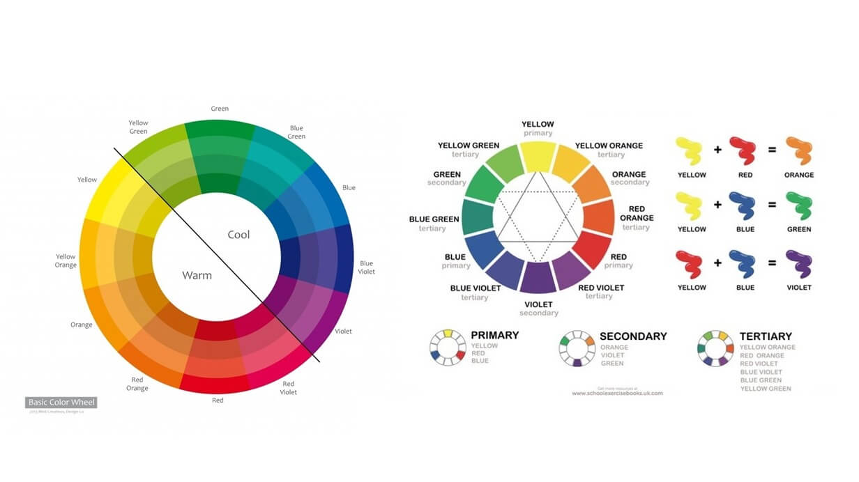
When using the tool, you may want to cross-reference with the color wheel. This is a great visual tool that helps you understand the logic behind pairing colors together, whether that’s two or five. Keep in mind, the color wheel can’t possibly show all the colors that exist. Within each color, there’s many different shades and tones but the basic principles still apply. Let’s take a look:Â
Complementary colorsÂ
This may be the most common and simple of color combinations, as it’s two colors opposite each other on the color wheel. Since they’re so far apart, these colors have a high contrast and “pop†when paired together.Â
Analogous colors
Very different from complementary colors, analogous colors are three colors that are next to each other on the color wheel. A common combination you may think of is the sprite colors, with dark green, light green, and yellow.Â
Triadic colors
This is three colors spaced evenly on the color wheel, creating a balanced color combination. This also creates a high color contrast.Â
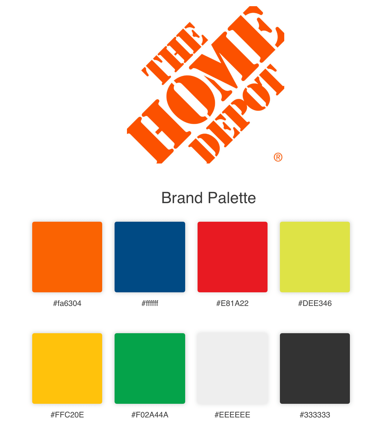
When you think of Home Depot, a tool guy might come to mind, but their store has offerings for all different kinds of projects and people, which is shown in their color palette. Considering Home Depot carries paints, they aren’t afraid of color.Â
Their signature color is a bright orange, a color commonly associated with adventure and creativity. The other colors in this palette reflect the different life projects created with products from Home Depot.Â
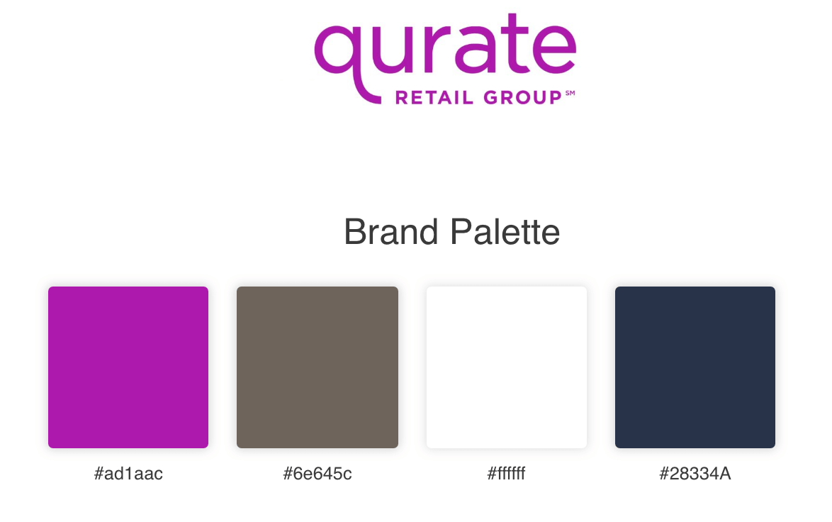
Sometimes, less is more and that’s exactly what Qurate did with their color palette. Purple can represent imagination and compassion, elements of an experience that shoppers want. Purple is definitely the pop of color in this palette and balances nicely with the neutrals that accompany it.Â
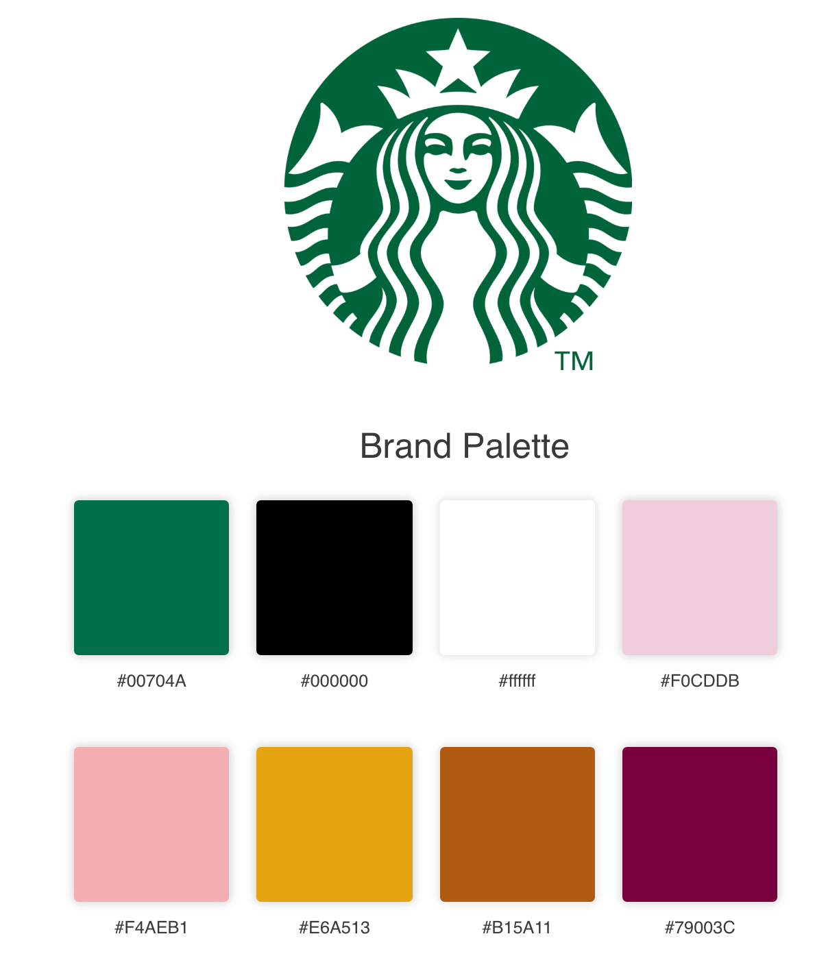
The Pumpkin Spice Latte isn’t the only signature of Starbucks. They are widely known for their deep green color, that could be spotted by most consumers even without the logo. Green is a very calming color that can mean balance, health, wealth, or stability.Â
Depending on how you view your cup of coffee, it could mean any of those! The other colors, collectively having a warm tone and ranging from pink to brown-red, are closely placed on the color wheel, which could make them an analogous combination.Â
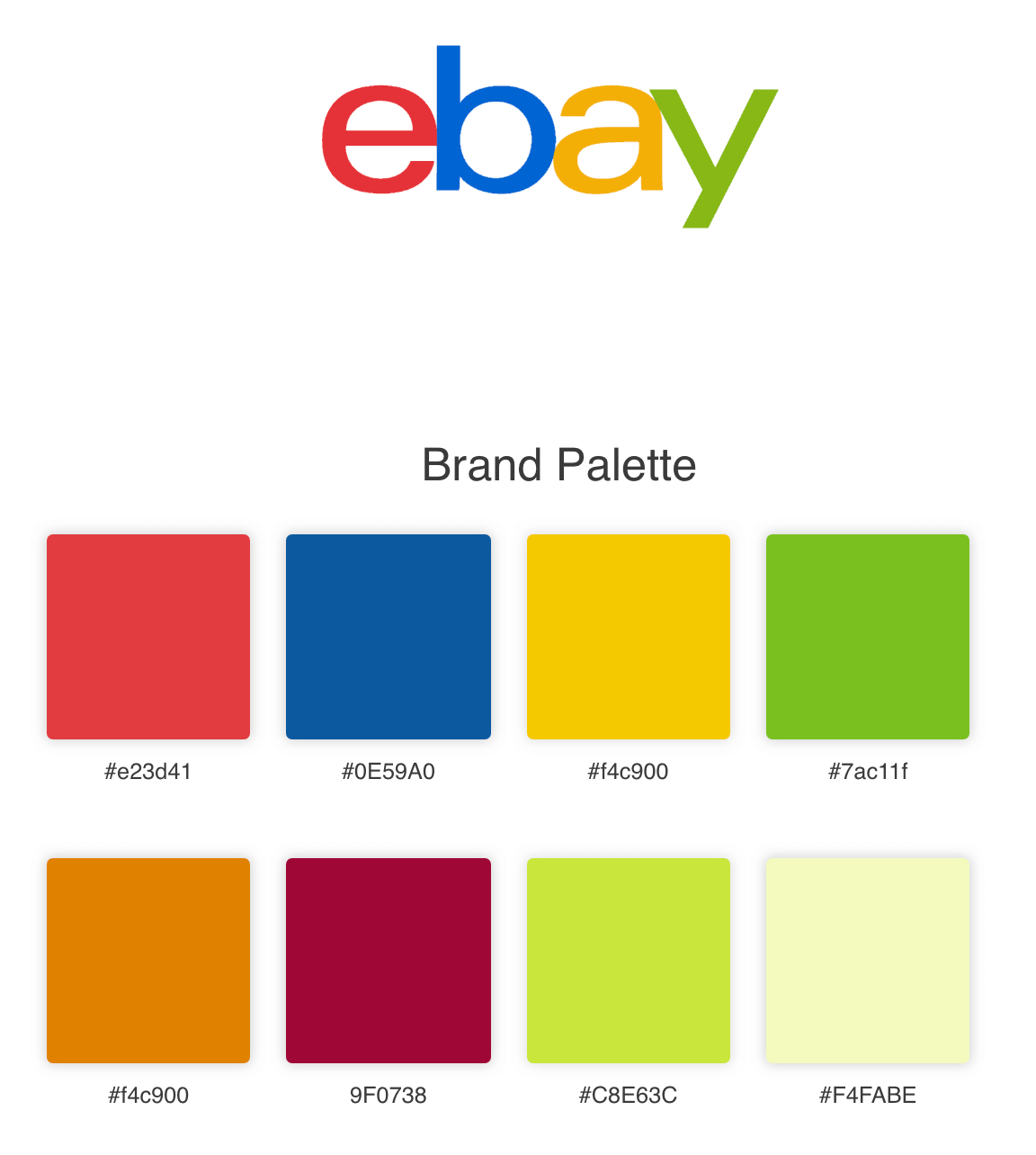
The infamous eBay letters have withstood the test of time and are a classic brand indicator. When eBay picked these colors, they weren’t looking for subtle, that’s for sure. This color palette closely reflects a triadic color combination, as the reds, blues, and greens create a balanced combination on the color wheel and yield a fun color palette.Â
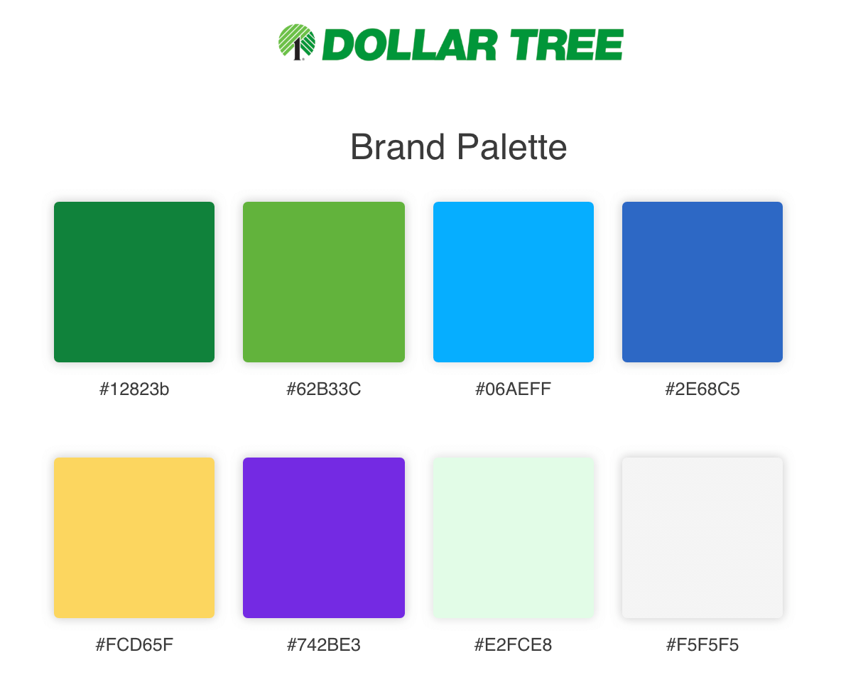
When you think of a dollar, what’s the first thing that comes to mind? The color green! Green is usually thought of in relation to money. It’s no surprise that there are three different shades of green in this color palette that make an analogous combination.Â
Another analogous combination is with the blue and purple colors. A pop of yellow is an accent of positively that is also neighbor to the green shades.Â
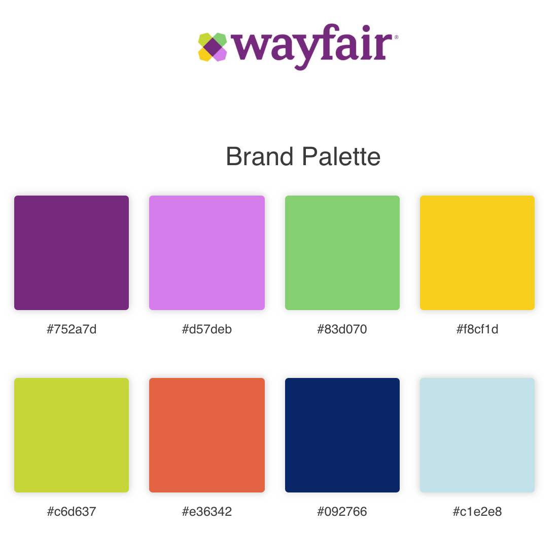
Similar to eBay, Wayfair does not have a subtle color palette. This online store is most commonly thought of with redesigning spaces or decorating new spaces, making purple a great staple color for creativity. The bright greens, blues, red and yellow resemble a triadic, creating high contrast.Â
Summary
When it comes to colors, the options are truly endless. It’s not about finding the perfect fit but finding the right fit. Each brand has a brand message they’re trying to convey, and their color palette is just another representation of this message. Colors can evoke feelings in consumers, that support the message of their brand. Using colors in design is a support to all the other elements of design, making it crucial but also just a piece of the whole puzzle.Â
Comments will be moderated and
rel="nofollow"will be added to all links. You can wrap your coding with[code][/code]to make use of built-in syntax highlighter.