Introduction
Single-page websites are often designed around super-striking visuals and have a cool, modern feel.
But this trend may not be for every site.
Single-page sites tend to have less content than scrolling sites and offer a very limited amount of real estate.
The challenges are to include enough content to be relevant and entice users, while not making the site look or feel too cluttered. Typically these sites do one of two things: Preview something that is coming up -- such as a new site design or event countdown – or encourage you to click through to other parts of the site.
The benefits can outweigh these challenges for certain types of websites. Single-page sites tend to have a contemporary feel and unique look. They can grab a users attention and encourage them to action of some sort because there is not much information to digest. They also tend to mirror the feel of mobile sites, with a look that more and more users are getting used to.
More recently, sites are expanding that single page trend from a single page to single “pages†with each scroll. This design style even employs multiple design schemes as the user scrolls through each new page.
How can you make the single-page design trend work for your next project?
Single Page with No Navigation
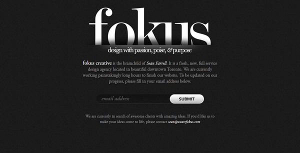
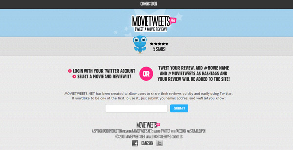
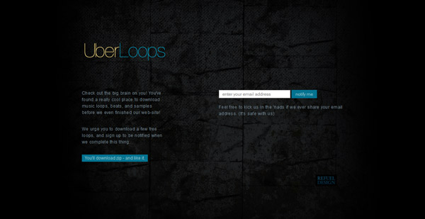

Sometimes a single page is all you need for your message. So why clutter it?
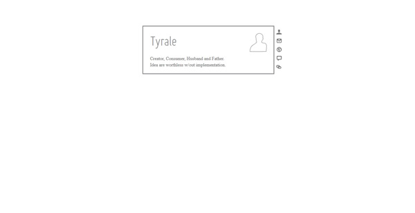
Single pages with no navigational tools, clicks or scroll are most commonly used for things that are coming up or as placeholder while a site is under construction. More and more, creatives (designers, photographers, artists) are also using this type of design for online portfolios.
And they can also be very creative.
Just remember to include a call to action so users know what you expect them to do with the site such as return later, fill out a form or attend an event.
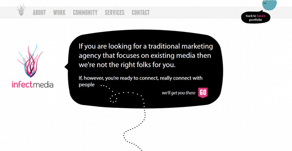
Single Page with Click Navigation

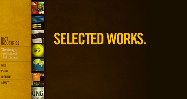
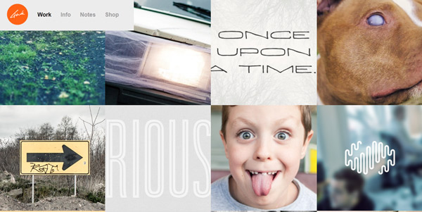
The most common form of single-page design includes navigation and clicks for users. While the landing page may not include a scroll, subsequent pages may.
This technique is an easy way to catch a user’s attention and then encourage him or her to spend some time exploring the site. Navigational devices and places to click should be very apparent so that users to not get frustrated and leave the site too quickly.
Single Page with Scroll Navigation


Single-page design with scroll navigation is one of the trendiest uses of the single-page technique. Designers create multiple “pages†that appear as single screens as users scroll through the site.
The effect is fun and can be quite stunning when executed properly.
Consider ideas that allow users to scroll both up and down from the landing page. And don’t count out the left to right (or right to left) scroll. For the most impact, each “page†needs to stand on its own and have a distinct feel, including start and stop points.
Make sure users know to scroll to get the full effect. Use a visual tool (or even words) to tell users how to use the site.
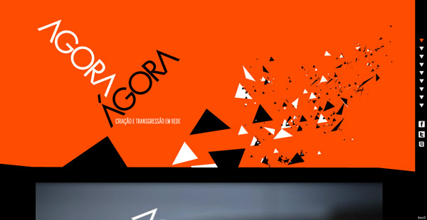
Single Page with Added Effects


Single-page design sometimes needs a little something extra to take it to the next level. That’s where your best tricks come into play.
Add a hint of animation or hover effects to add interest. Showcase custom typography or artwork that is unique to your site.
But be cautious of using too many extras. Pick one “thing†– effect or design technique – that really fits your site and go with it.
Tips for Success
There is only so much space to work with when designing single-page elements. Maximizing that space will give you the most bang for your design buck. Here are a few suggestions.
Keep it simple. Don’t go crazy with colors and fonts. Too many things to look at can be overwhelming in a small space. Know what message your site should convey and stick to it.
Think about proportion. If you have a lot of text to include, consider another format. Making things too small just to get them on the screen is not effective.
Create hierarchy and easy navigation. Show users what to look at and where to click or scroll (if applicable). Make sure users know what you want them to do with the site. Make sure navigational tools such as menus, places to click or scroll and contact or site information are easy to find and use.
Show off. Showcase your web design talent. Add little extras to surprise users – animations, hover effects, great art or typography. Put the spotlight on the thing you do best when using this design style.
Comments will be moderated and
rel="nofollow"will be added to all links. You can wrap your coding with[code][/code]to make use of built-in syntax highlighter.In my quest to learn more about the SPA, I have registered for a webinar on Benefits of developing Single Page Web Applications using AngularJS, it looks a promising one http://j.mp/1a9aK6t