Readability is an important aspect of web design usability and that is not a secret.
If readability is done correctly, it will allow the users to assimilate easier the information given in the text. This will depend on a few factors like the content structure, style and design.
Legibility, on the other hand, is a measure of how easy you can distinguish a letter from another in a typeface. While making a text readable is doable, making every font legible is impossible, because not all fonts are designed to be legible.
There are a few factors that affect a typeface’s legibility like weight, character shapes, ascender and descender length, size of counters, stroke contrast and character width. A good start to make your content legible is to pick a good elegant font that does its job properly.
Improve readability
The first thing that most designers think of when wanting to improve their site’s readability is making the font larger. That can improve things this way up to a point, but it can’t do that much good. Here are a few better advices:
- Another more useful tip to improve readability and which I’ve mentioned before in an article about web typography is having a text hierarchy. This instructs the user how to read the content by differentiating the headers from body text and various other typographic elements, like a quote or a side paragraph.
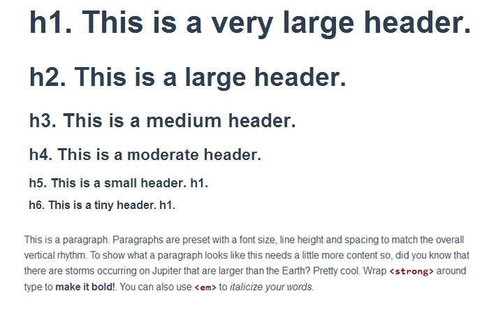
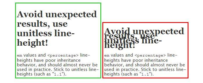
- The vertical space between lines of text, also called leading, or line-height in CSS, should be 30%-50% larger than your font size, especially on web. Most designers use a line-height of 1.4 as a standard.
- Use font case properly. Try to avoid upper case. Most of the times it is difficult to read. The only way it is advised for usage is in small titles.
- Use contrast wisely. A good contrast will make the text easy to read, while a bad one can ruin the user’s experience on a website. An example of good contrast is black text on a white background, while a bad one would be red text on yellow background.
- The measure, or line length, should be between 65 and 75 characters. Having more than this standard may bore the visitors and will stop them from allowing their eyes to flow from the end of one line to the next one easily.
- Use white space whenever possible especially on content-heavy layouts to improve readability. It will separate the elements in the layout and make the visitor’s task of reading the content much easier. The easiest way to do this is by using a grid system. In this way, you have the guarantee that there’s a proper amount of space between the site’s elements.
- Avoid long paragraphs. I’ve noticed that many people are complaining about websites which don’t break their text into smaller paragraphs. You can do this by starting it with a line space, drop caps, ornamentation, indenting or outdenting.
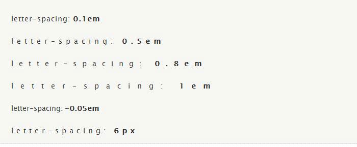
- Letter spacing, or tracking, is the space between the letterforms in a word or block of text. It can be used to adjust the density of a block of text or a headline. Using it properly will deliver the desired results, however, using letter-spacing wrong may compromise readability.
How to pick a legible font
The legibility issue can be solved easily: pick a good font. But how can we do that? Choosing a typeface has never been easy and with the multitude of fonts that designers create, the pressure is overwhelming.
When choosing a typeface, it is important to choose one that has enough variations in weight and style so that you can highlight certain elements of the text in the eyes of the visitor. There are fonts like Helvetica Neue, for example, that also have other weights and styles besides bold and italic, like light or ultra light which can make a difference if you want to focus on the site’s typography.
A good way to filter out the fonts that most likely will not return the desired results is by selecting the ones with consistent design characteristics and conventional letterforms. You should avoid any fonts that have bizarre shapes, artistic touches or various ornaments.
Letter spacing is an important factor in choosing the proper typeface. Avoid fonts that seem too tight or too open. Also, pay attention to kerning. Kerning is the process of adjusting the spacing between characters in a proportional font, usually to achieve a visually pleasing result. Quality typefaces have built-in kern pairs, which will deliver a better visual result.
Consider pairing fonts
On web there’s rarely a situation when only one font is used. Most of the times, designers pick two fonts and pair them together for the content, one for the titles and the other one for the paragraphs.
To do this, you must be sure that they work good together. The best way to find out if that’s the case is by testing it. If you look on various websites you will see that there are two combinations most commonly used: two sans-serif fonts, or one sans serif for the headline and a serif for the body copy. Choosing these could be a difficult task, but if they are in tone with your site’s design then everything will be alright.
However, until testing you must take some factors into consideration. For starters, you may want contrast between the two fonts. If that is the case, then you can have a contrast in style, size, weight or form.
Comments will be moderated and
rel="nofollow"will be added to all links. You can wrap your coding with[code][/code]to make use of built-in syntax highlighter.