Introduction
Responsive design is the biggest trend in web design right now. There are so many types of screen sizes -- desktop, laptop, tablet and phone and – that responsive design seems to be the perfect solution because it allows you to create a website that adapts to different screen resolutions. It’s challenging to fit a desktop website into mobile screen. To do so, content has to be hidden, images have to be resized and some elements need to be shifted. Here, we are going to look at the crucial UI component of a website navigation menu as it relates to responsive design.
There are many solutions, including select drop down menu, CSS drop down menu, toggle navigation, block, footer/anchor and sidebar navigation. Each solution has strengths and drawbacks. Depending on your needs, layout design and timeframe, this article should help you choose a solution that fits nicely in your website design.
Make it smaller

Creating a small-scale site is the simplest solution. Play with the CSS to make sure the navigation menu fits perfectly in small screen. This solution works most effectively with a limited number of navigation items. If your navigation menu has more than four items, this is a not a particularly viable option. However, some users may find it hard to read and difficult to tap on the link correctly.
Examples
Resources
This method requires CSS skill. Make sure the navigation menu fits nicely in a small-screen format by changing the font size and spacing between menu items.
Block

Much like shrinking the design, but the block method includes more CSS style treatments. The CSS styles aim to make navigation menu items easier to read and tap, which can solve issues with small and difficult items to tap. However, laying out the menu item as blocks can take up a lot of screen real estate, and may not be the best design choice for mobile devices where the screen size is limited.
Examples
Resources
- An Alternative to select elements as anvigation in narrow viewports
- Code a responsive navigation menu
Select Drop Down Menu

Using the browser default select box is a common solution. This method of creating a Select Drop Down Menu converts UL list into a select list. It requires Javascript to populate list items into a drop down list. Different browsers will render select boxes differently, hence, with this method you get inconsistent UI. To solve this problem, you can use javascript plugins to skin select list, but it has the potential to introduce even more hassles. If UI inconsistencies are not a problem, this is one of the better solutions.
Examples:
Resources
The following plugins turn any OL or UL into a Select List for mobile and small-scale browser sizes.
- Responsive Mnu by Matt Kersley
- TinyNav by Viljami Salminen
- Convert Menu to Dropdown by Chris Coyier
- SelectNav by lukaszfiszer
CSS Drop Down Menu
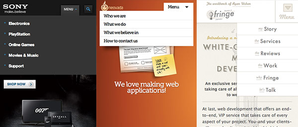
Using the same concept as with a Select Drop Down Menu, you can create a CSS Drop Down Menu. In mobile devices or small screens, the navigation menu is hidden and replaced by a menu button. Clicking on the menu button will toggle the visibility of the navigation menu. This solution doesn't push the content down, but instead displays itself above the content. The best thing about this solution is that you get to match the menu to your design scheme, eliminating browser inconsistency issues.
Examples
Resources
- Mobile Navigation Design Tutorial by Web Designer Wall
- Responsive Drop Dwon Navigation Menu by Azad Creative
Toggle Menu
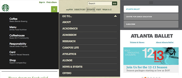
Similar to CSS Drop Down Menu, this method hides the menu and replaces it with a menu button. Users toggle through menu items by clicking on the menu button. This method will push the content down the screen, and it is recommended to accompany the Toggle Menu with a slide down effect which makes this solution simple and elegant. Of course, this method requires javascript. A Toggle Menu is one of the most common solutions because it doesn't have the UI inconsistencies of other options and it won't take up a lot of space.
Examples
Resources
- Flexible Navigation by Jason Weaver
- Twitter Bootstrap
- Responsive Toggle Menu by Terris Kremer
- Big Menus, Small Screens Responsive Multi Level Navigation by Tessa Thornton
Footer Anchor

Developing a Footer Anchor is another simple implementation. Start with two navigation menus, one in the header and one in the footer. When the screen size is small enough, header navigation will be replaced by an anchor link that points to the footer.
Examples
Resources
- A Simple Responsive Mobile First Navigation by Tutsplus
Side Panel Menu

If you are using iOS, Side Panel Menus are not a stranger to you. Inspired by iOS app such as Facebook and Twitter, this sidebar panel method simulates the same effect as when a menu is hidden on the left side of the screen.
Examples
Resources
- jPanel Menu by Anthony Colangelo
Other Mobile Navigation Methods
Aside from the common solutions, are a few other more advanced options -- Popup Navigation, Pull Down for Navigation and Path Style.
Popup Navigation

Popup Navigation menus are displayed in a popup module, such as the one by Remodelista. This can be implemented with modal window such as FancyBox or you can use our Modal Window tutorial to create your own unique Popup Navigation style.
Path Style

Path Styles are a bit fancier than many of the other options and are heavily dependant on CSS3 and Javascript. When a user presses or, menu items expand and place themselves around the main button forming an arc. To close the menu, a user must select one of the options presented or press the main button again. If a menu item has submenu items, a user can either navigate back to the previous level or select one of the choices presented. It's not a free solution, and you can get it from Path Style Menu.
Pull Down
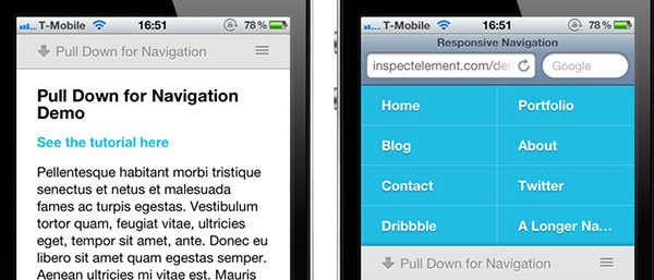
Using the concept of "pull down to refresh," the Pull Down experimental mobile navigation menu replaces a UI element with a natural gesture. You can view this implementation from Inspect Element.
Conclusion
Personally, as I have been building responsive layouts my favourite solution is to use a toggle navigation menu. It's simple, yet elegant. The menu is easy to implement and looks good with animation.
I hope you will find this article useful. It's always good to have someone research possible solutions, saving you time and effort. If you want to read more about the drawbacks and strengths of responsive navigation menus, check out Brad Frost’s article on responsive navigation patterns.
Comments will be moderated and
rel="nofollow"will be added to all links. You can wrap your coding with[code][/code]to make use of built-in syntax highlighter.Seems like a pretty easy to use solution.
Just want to say this is an amazingly written article. The way you have itemised the choices and provided links, examples, comments and images is outstanding.
I was researching some mobile nav menu solutions and your article came up.
Other designer writers would do well to adopt your content layout strategies for their own articles. Indeed so should other online magazines when doing "options" type articles.
Regards