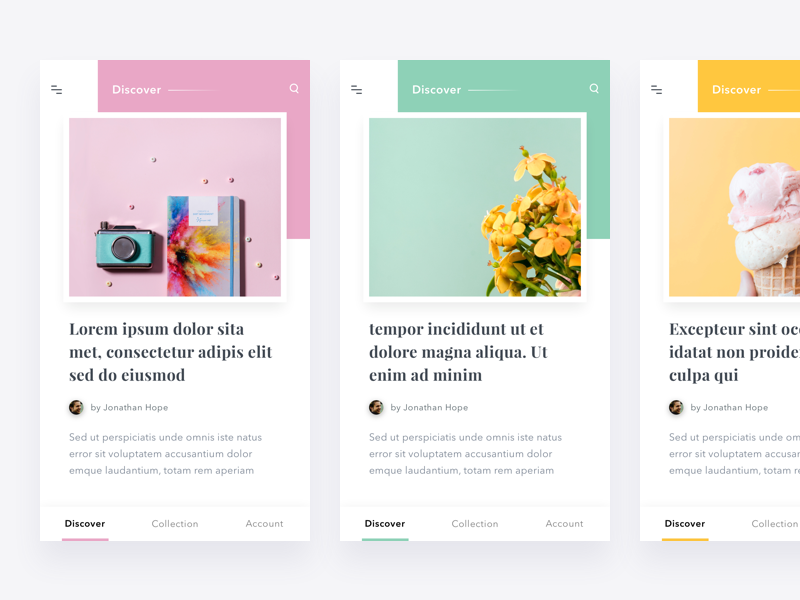
Every designer who cares about his users’ experience has the role of a user experience designer.
What we want to share with you here is that this role is going to become the most important part of a designer’s work.
So far, user interface design was not so challenging. It consisted of simple navigation/contact forms and it was mostly static and unintuitive. However, the constant development of technology brought us to a level where we can no longer escape from demanding dynamic experiences.
You would ask why. Well, simply because people are impatient. They don’t like to lose time and they don’t want to be bored. They tend to fins obstacles in tiniest details and they have no second thoughts whether to move away or not. As scary as it sounds, competition requires all of us to become professionals. It is the price every successful online enterprise has to pay.
The approach can be explained like this: we need to design a welcoming user interface which can keep customers actively engaged. We will present you the most important design principles; and we would advise you to perceive them as the rules of your work:
Rule of clarity
Use simple, common flows and communicate in an open and clear manner. Users want to meet a familiar language which provides excellent shortcuts to what are otherwise long procedures.
Users tend to avoid what they can’t understand. Applying elements which make people wonder how to use them is not going to give rise to usage either way.
Rule of proximity
Clear division matters a lot. Interrelated items need to stand together, so that it will be clear they belong to the same category.
Otherwise, items that have nothing to do with each other should be obviously divided.
Rule of similarity
Similarity is the most common mental perception of your users. they associate items with similar features, and divide such that look nothing like each other.
Make sure they’re right about it.
Rule of guided action
You are the first one to develop an action strategy for your design: You need to make it clear when something is really required from your users, or to add intuition to the things that are not.
One way or another, a designer guides his users. He asks them to perform an action (go to a page, fulfill a form) and he doesn’t have unrealistic expectations for them being aware of how things work on his new website.
Hick’s rule
According to Hick’s rule (or Hick's law), the speed of reaction depends on the variety of choices presented to the user. For instance, take a situation where the user has 8 buttons to choose from.
His fastest reaction will be when all but one button is covered; whereas his slowest reaction happens where all 8 buttons are open and available to choose. Â
How can take advantage of this rule in our designs?
- we could simplify our layers to incent speed (we would exclude all useless frames and lines).
- we would minimize the content of our menus to incent quicker decision-making (we would include no more than the basic items).
Rule of context
It is our human nature that makes us want to control things. That’s exactly why we usually expect to face interface elements that correspond to our controlling targets. The best thing about it is that when we want something, we get up and we do it. Interface design is no different.
We become better and we expect software to make things easier for us. We don’t want to perform thousands of actions in order to gain control over the desired item.
How can a designer help? He can keep things accessible and intuitive. He could enable us to perform every possible modification of an item; and he should inform us over this possibility.
Rule of continuation
Similar features or hierarchical orders can create a feeling that items are interrelated and that they belong together.
Thanks to clear visual cues, a user can follow a sequence and keep performing the same task until something more important appears.
Rule of feedback
You want your users to trust you? Communicate with them! Let them know they are on the right way or that they’re losing track.
Users should know every mistake, state change, or exception that is relevant for the accomplishment of their tasks.
Additionally, feedback should always be clear and unambiguously written, so that even novice users would know what it is about.
Rule of defaults
The rule of defaults is a mandatory rule. You need to keep an eye on default settings because users are not really likely to adjust them. Defaults should be usable and practical, and there should be no need to change whatever.
Wondering why defaults are so powerful? Take few real-life examples:
- - When was the last time you altered the background/ringtone of your phone?
- - Did you ever change the factory settings on your TV?
- - How often do you adjust your fridge’s temperature?
Defaults are not so visible, but they are always there. That’s why you need to keep them practical and to assume they are good enough not to be changed.
Rule of tolerance
A tolerant and flexible design is the best guarantee that there will be no unexpected costs, mistakes, or misuse.
You should be able to predict potential errors and to prevent them with tolerance-varied input and sequences. How do you do that? You consider and interpret every possible scenario!
Miller's Number
People are able to perform no more than five simultaneous activities without making a mistake. By the time you give them nine things to do at once, they are 99% likely to make a mistake.
It was Miller who established this upper-limit notion (or channel capacity), saying that such happens when people process information. Once people start receiving more information than they can process, the channel is overloaded and their capacity is exceeded.
Therefore, the more items you include, the likelier your users are to make a mistake. This happens especially when you are designing dashboards. You might be tempted to put everything in there, but think of the information overload. Use less items and break them in sub-actions, and you’ll get less time spent on customer support.
Rule of easing
There is no way to make an action simpler? Break it into several smaller actions.
It is human to avoid long and complicated procedures. This counts especially when we have to fulfill large data forms, because the task requires further action: we are bored and we are running out of time, and we still have to recheck what we’ve fulfilled. The forms, however, receive a completely new look and manageability when you divide them in progressive steps.
That’s how people like to do stuff - they prefer 10 smaller tasks to a single big one. Smaller tasks don’t scare people and they feel confident to deal with them.
Rule of accessibility

If nothing else, make sure you’ve provided enough safety and accessibility in your interface design. Accessibility in design stands for the extent to which the product/service is available for a larger portion of a market’s users.
Still, accessibility is not usability. Usability stands for the degree in which the product/service manages to fulfill effectively the purpose why it was created.
Then, usability must not be confused with desirability. But neither do people always do what they want! We want to make basic stuff easier and to make them feel grateful for that easiness. If nothing else, they’ll remain loyal (and desirability comes right afterwards).
So, were those rules or guidelines?
There was a reason to name them ‘rules’ and to compare them to ‘laws’: there has never been a design which complied with these rules, but failed to attract customers. Good experiences should be shared, shouldn’t they?
Breaking the rules, on the other hand, would ‘reward’ you with a crowd of grumpy users complaining around the web on how bad your interface was. Don’t try this at home!
All jokes aside, interface design ought to be treated with care and responsibility. The rules we mentioned could help you do your job properly, so make sure you only break them when there is no other choice.
Comments will be moderated and
rel="nofollow"will be added to all links. You can wrap your coding with[code][/code]to make use of built-in syntax highlighter.