With these challenging times, many people have turned to online shopping. It's faster, more comfortable, and you can do it at greater volume. Many people even started their online way of branding and selling. When you create an eCommerce site, you create an opportunity for yourself to design a whole new brand.Â
Everyone wants a website that works well and has all the characteristics to make a great UX. A good UX leads to more numerous sales. To design an eCommerce store is to know how to convert random visitors into loyal customers. You have to pay attention to every single detail. From the front page to the tiniest feature, you have to be careful when designing.Â
You want your design to make the purchase more accessible, quicker, and as relaxing as it can be. Optimize your website for maximum performance. Your main goal is to attract and keep new customers.Â
We've created a record of instructions that you can follow to improve your conversion path. Read more to find out how to make your website exemplary in no time.
Keep the user in mind
You want your whole website to be based on the users. Everyone wants to create a website like Amazon, but few realize that Amazon is where it is now because it focuses on its users.Â
It is crucial to know how ad make how to drive one towards a purchase smoothly. Every image, word, and product should be placed so it will affect the visitor somehow.
For example, when you have a small number of products, you don't need to add a search option. That is unnecessary. On the other hand, if your company offers a large number of goods and services, you might need to place that search bar on the front page. There it is easily visible and accessible.
Keep it minimal
When creating a website, you have to make it simple. Many visitors are driven away by clutter and disorganized content. They want something that they can use instantly without much effort. A minimalistic design is a perfect way to present minimum content with the maximum outcome. For the background, it is best to use a simple white layout with a simple color scheme.Â
The usage of white spaces is also mandatory. They keep things away from each other. And, they make content understandable. Use the same width for the whitespaces.
Create a natural flow
When you make the online store's design, you must ensure that your content and composition are consistent and flow naturally. Think about what makes the eye first drawn to the site. Then, implement that.Â
Make branding a priority.
During the design process, make sure to make your brand look credible. Establish a line of trusted products. People can easily spot online scammers. And, you don't want to look like a faux website. To build trust in your customers, you have to increase your leads and sales. The way you brand your company is how you're going to be seen on the market.Â
Use color to your advantage
Think about the psychology of color. You know that many colors affect mood, thoughts, and feelings. To make your eCommerce page convert numbers, study the impacts of color.Â
Perhaps you can use a bright, vivid color for buttons that call for action—Red, incredibly bright red, causes people to get excited. Just by using red on your site, you can drive conversions up by thirty-four percent.Â
Add clear CTAs
We've mentioned how important it is to have a button that drives people to act. You can recognize many CTAs. They often go by the names of "Buy Now" or "Add to Cart." The CTAs have to stand out from the rest of the content. That is to attract attention. You can also use contradictory colors to make the whole experience even better.Â
Boost Conversions by Limiting Decisions
Another marketing and branding trick you can implement is limiting the choice options. First and foremost, minimize the number of navigation options a user has. You don't want to create a mess in your user's head. If you offer many options, it might be too overwhelming, and he will lose interest.Â
Keep filtering option available
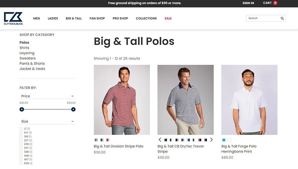
Many websites started using the filtering option on their product page. When a customer goes to your site to search for a product, he will enter a maze of confusing products. Instead, to make his job easier, add the filtering option. There, he can choose the configuration, features, and price of the product. If none of his preferences are available, he wants to know immediately.Â
Include maps
To know who is visiting your website and find the demographic's geographics, add location data. Once you locate your customers, you will see whether conversions are possible or not.Â
You can use gamification to drive conversions. To do this, create a location-based game. There, users will have to interact with your website and lead to more traffic.
Use maps to visually present content. As the attention span decreases, many users will want a visual representation of the content you're selling. Use maps to explain your business. To illustrate this better, imagine a housing service. It has to display a map of where the home for sale is located.
Â
You can also use the mapping technique in eCommerce. For example, when you go to a page and a location is required to continue. Once you allow the site to track your geolocation, it can use that same data to show you shipping costs.Â
International sales work on the same principle. The location-based data can help automatically change the currency.Â
You can also add discounts to specific locations. When a user visits your site so often from a particular place, these automatic services activate a promotion.Â
And there’s a different type of map that you can use. You can use indoor mapping tools to create a map to your physical store so clients get familiar with your store layout.Â
Keep the shipping cost upfront

It is also essential to show how much the shipping cost will be at the end of the purchase. Many users get irritated by the lack of information they have about shipping when shopping.Â
Add those delivery details on the front page, preferably next to the product. That way, the customer will make more rational decisions when it comes to overall shopping.Â
Quality photos

Another thing that irritates many customers is low-quality images. If you want to keep your customers returning to your company, use better pictures of the products. You can even add videos that explain how the product works and the features it has.Â
Show scarcity
Scarcity makes people go wild when it comes to shopping. Many companies use this strategy to make people pay for products that are unbelievably expensive and unnecessary. Human psychology is impressive.Â
To cause your conversions to skyrocket, create a scarcity of the product. Make the products be out of stock or with a limited number in the products category. People will rush to buy it simply because there is less of it available on the market.Â
Testimonials and Reviews
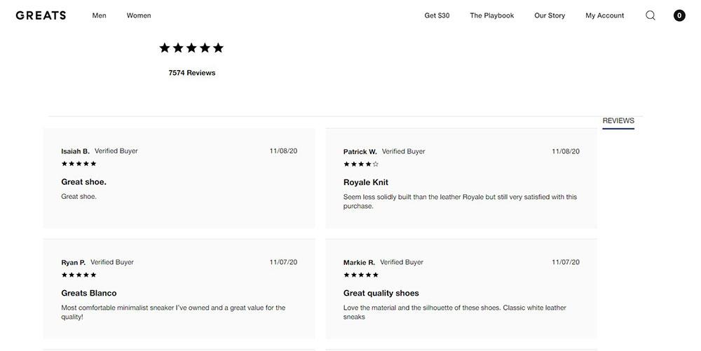
You could also improve your traffic by adding a whole page dedicated to testimonials and reviews. It is proven that 61% of online shoppers review critiques before purchasing a product. Tell your dedicated development team to can add an entire segment on the website to allow users to read experiences with your work.Â
E-commerce sites should be secure
With the increasing number of online frauds, many are skeptical about using websites to purchase things. To gain trust, use SSL on your site. In this way, the payments are secure there because they have a secure gateway key.Â
Contact Information
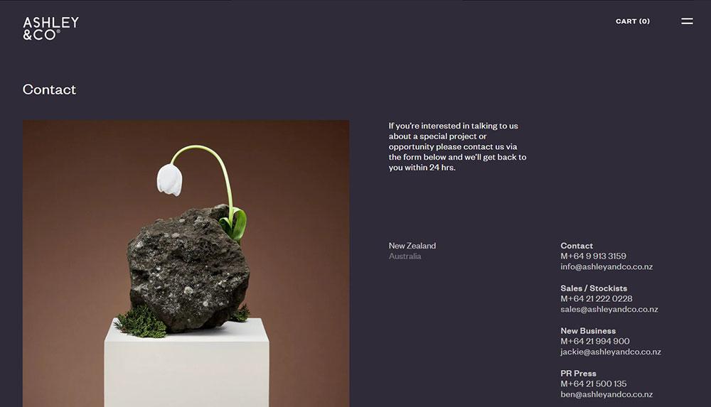
To earn even more credibility about your company, add a section to your website about your contact info. Add your email, number, and location to make it for users to contact you quickly. You can add it to the bottom of the front page.Â
Create an FAQ page
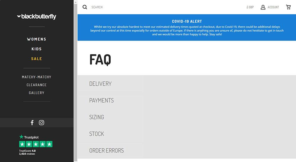
Many eCommerce sites are starting to use FAQ. They are required. Although sometimes annoying, they often offer transparency about your business. You build trust and connection with your customers. They want to know as much as possible before they decide to work with you.
It would be best if you always remembered that your website is accessed through mobiles and tablets. That is why it is essential to create a stable mobile version for any device. This can spike up your leads.Â
Designing an eCommerce website can be tricky—though now that you understand the top web design pointers for eCommerce, you possess everything you need to create a site that not only looks amazing but converts like crazy.
Comments will be moderated and
rel="nofollow"will be added to all links. You can wrap your coding with[code][/code]to make use of built-in syntax highlighter.