It’s difficult to imagine a mobile phone without apps. Surprisingly, as recently as 2008 we did not have apps on our phones or tablets. That is the year Apple launched the iPhone and their App Store. They offered one hundred apps back then.
Now there are thousands. Shortly after the iPhone and app store were introduced to the public, mobile design became a hot market.
Technologically speaking, the market climate was right because mobile hardware now existed, smartphones supplied the platform for users and consumers wanted them.
Good Experience Makes a Useful Apps

Buyers became app smart quickly and discarded apps that didn’t perform well. Creating an app for today’s discriminating user means giving the user a useful application and a good experience.
You may have designed your app on paper and even created a prototype but that’s just the beginning of the process.
Follow through and your design may strike a chord with smartphone users. If that happens, you stand to make a lot of money and gain recognition
The Demand is for Fast and Powerful Apps

That is not easy to do because you are using a UI design for small screens. You don’t have much room, but your app design must be fast.
Smartphone and tablet users expect an app to work as fast and they think. Apps are time savers and organizers so slow apps are not an option.
You must bring a powerful app design to market that will not confuse novices or bore the seasoned user.
What Is Your Vision?

Â
Any entrepreneurial venture starts with a vision. If you have a vision for an app design, what is your goal for the app? Will the app be a utility that everyone can use?
Maybe your idea is for a special use that would benefit a specific group of people like nurses, students, or cab drivers.
Keeping your goal in mind will help you stay on track during the design and development process.
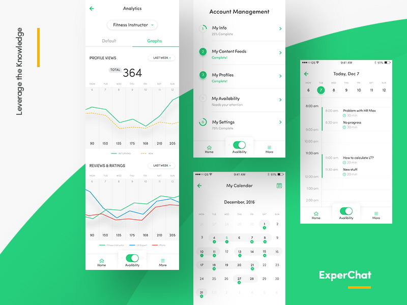
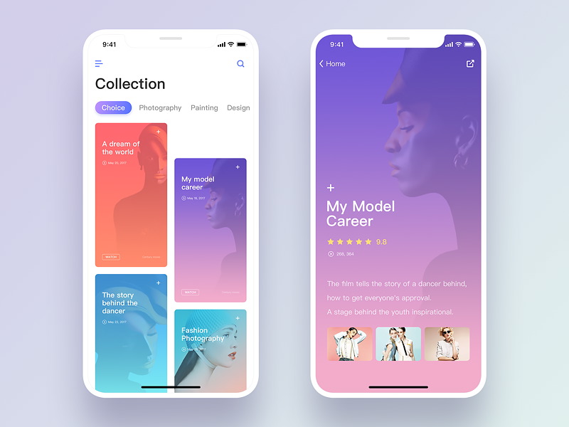
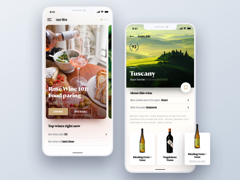
Create a Prototype

You can create a prototype of your app with Wireframing. There are other online tools for prototyping but Wireframing is easy and fast.
Look for the prototype tools that allow for drag and drop graphics and placeholder. Some will let you add a button which will allow you to click through your app using review mode.
Flow and Features
Legalizing your idea for a new app confirms your belief that product consumers will be interested in. You need to document, in detail, your product and take the additional precaution of making a prototype with a wireframing tool.
Documenting your product on paper includes every detail including all the features you want to be included and the flow of navigating the app by a user. As the designer, you need a clearly understood prototype, so the developer will meet your expectations.
Clearly, define your goals for your app on paper.
- How will the app be used?
- What information should each screen present?
- How does a user get from start to finish; what’s the flow?
- Screen elements should be relative in size to each other.
Try using your app. That will give you a clear understanding of the how well certain components operate and where additional design work is needed. Keep your focus on the end user and the two primary platforms which are iOS and Android.
Five Steps of Interaction Design
- Interactive Design is Goal Driven: Know your end users. Research those most likely to use your app. Once you understand how they will use the app you can tailor the flow of your app to meet their needs.
- Usability: Your app design may be useful but is it easy to use? If using it proves cumbersome your intended market may not download it. Usability is the key to desirability.
- Signifiers Point to Function: The affordance is the function. Use signifiers carefully so the app user can avoid the mental process of figuring each one out.
- Design for Instinctive Use: A kid picks up a new electronic device or downloads a new app. He may not know how to use it yet but he instinctively knows how to learn it. Experience has taught him common interface design patterns and he expects that familiarity in new apps. Familiar patterns will make learning a new app easy; users want easy.
- Feedback Confirmation: When using an app, you wait for a signal to confirm a process is complete. Your order has been accepted, your message was sent, your deposit is received. Confirmation may come as an email, a beep or a new window with a confirmation number. Nobody wants to wait more than a few seconds for this confirmation. In fact, there are timing guidelines to follow from Nielsen Norman Group. Make sure your feedback confirmation is fast and friendly. Â
Once you start sketching your prototype on paper you may experience a flood of new ideas. That is a good thing if the ideas apply to your original app concept.
Those that don’t apply can be set aside for a later app. Create each screen of your app and then experiment with the flow and navigation between screens and button use of copy.
Let Feedback be Your Guide
Once your app is available for download by users, you still have work to do. Pay close attention to the feedback from those first customers.
Apps are always being updated and improved User feedback will give you the best guidelines for moving your design forward and continuing to make a good app even better.
Your Own Experience is a Key Resource

As a designer, you are also probably an app user. Downloading and using apps on all platforms, especially iOS and Android, is your best inspiration.
Test all the apps; there are hundreds you have never tried. You may be frustrated by a particular app and feel compelled to design one that will do the job right.
Your own experience is a key resource for designing useful mobile applications that are powerful.
Give Time for Visuals
Visuals are important for the success of your app because everyone likes a good-looking app.
However, that’s not the only reason it’s important; visual inspiration is not only important because of the looks of your app, but also because of the way the user interacts with it. Try to learn all possible motions users are likely to use while interacting with the app.
Color Denotes Value

Color is used to lend importance and distinction of purpose to app buttons. Traffic lights prove that, and we often carry those color values into other areas of our lives.
Red and Green have great value; yellow is necessary, but we don’t value it as highly. A cell phone may have a green button to make calls and a red one to terminate the call.
Green has more value to us. The menu button is black because it does not top in importance. Be sure your color choices are meaningful.
Visual Consistency
Whatever color scheme you use for your app make the value of the colors consistent. If the “Go†button is green on one page, then it should be green on all pages.
20 px padding is on the first screen then it should be there on all screens. First, you define the value of a color and then you stay consistent throughout the app.
Fonts
It’s important for fonts in apps to be clearly readable in simple clean-lined text. A quick glance should tell the user the message. If you want to use a distinctive font save it for your logo or brand.

In terms of readability, don’t mess it up. Look at selections of fonts and use the one that fits best with your brand guidelines.
Also, that distinctive brand or logo in the atypical font will tell the user where they are. It’s like having a green door on a block of grey doors. You instantly know you are where you want to be. Don’t stay up all night obsessing over it.
Ending thoughts
We hope you find these guidelines for building an app helpful. We chose them for their proven effectiveness.
Building your app is your first challenge; getting customers to use it may prove to be a bigger challenge. You’ll find your way.
Comments will be moderated and
rel="nofollow"will be added to all links. You can wrap your coding with[code][/code]to make use of built-in syntax highlighter.