Making CSS3 Animation hover effects can be really easy! Previously, I shared a CSS3 animation library called Magic Animations by miniMAC. Today, we are going to use it as the animation engine for a series of thumbnail hover effects.
With the availability of open source projects, creating cool and subtle animation can be really fast and simple. By making use off-the-shelves library what we need to do is to create a structure and apply classes to it to animate them!
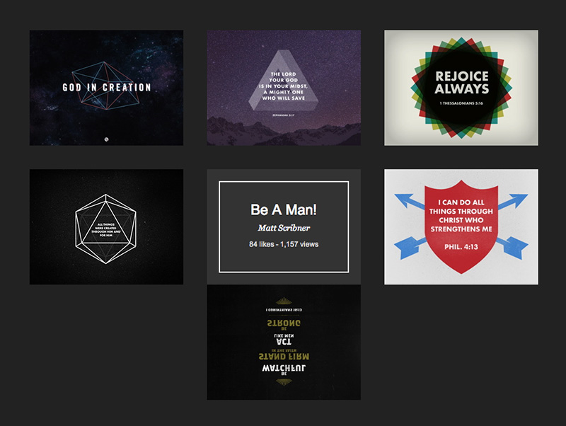
Here is the screenshot, and make sure you check out the demo to see its coolness!
HTML
We will make 3 layers wrapped inside a container called .box.
- Layer 1:
.linkTop layer, URL link, click to open in new window. - Layer 2:
.box-overlayMiddle layer, this would be the image. Once mouse over, this image will be moved away to reveal content underneath it. - Layer 3:
.box-contentBottom layer, we insert content here. Once mouse over, this content will be revealed.
The following is the HTML structure. We added .magictime, data-hover and data-return in .box-overlay class. We need this to animate it. You can change type of animation you want by changing its hover and return data value. For a list of animation, you can visit Magic Animation demo page.
<div class="box">
	<div class="box-content">
		<div class="box-wrapper">
			<!-- content put here -->
		</div>
	</div>
	<div class="box-overlay magictime" data-hover="puffOut" data-return="puffIn">
		<!-- image put here -->
	</div>
	<a class="link" href="#" target="_blank"></a>
</div>
CSS
CSS is pretty straight forward too. We added z-index for .box-overlay, .link and .box-content to make sure it's in the right order.
.box {
	width:260px;
	height:195px;
	margin:20px;
	float:left;
	position: relative;
}

.box-content {
	display:block;
	padding:20px;
	width: 100%;
	height: 100%;
	background: #333;
	color:#ffffff;
	-webkit-box-sizing: border-box;
	-moz-box-sizing: border-box;
	-o-box-sizing: border-box;
}

.box-overlay {
	width: 100%;
	height: 100%;
	position: absolute;
	top:0;
	left:0;
	z-index:10;
}

a.link {
	display:block;
	width: 100%;
	height: 100%;
	position: absolute;
	top:0;
	left:0;
	z-index:15;
}
jQuery / Javascript
Last but not least, we use jQuery to add and remove classes. Remember we specified the type of animation we want in .box-overlay's data-hover and data-return? This script will get its value and add the corresponding classes to complete the hover effect with the right CSS3 animation defined in Magic Animation library.
$(function () {
	$('.box').hover(
		function () {
			var overlay = $(this).find('.box-overlay');
			overlay.removeClass(overlay.data('return')).addClass(overlay.data('hover'));
		},
		function () {
			var overlay = $(this).find('.box-overlay');
			overlay.removeClass(overlay.data('hover')).addClass(overlay.data('return'));

		}
	);
});
Conclusion
That's it! Really simple. With animation library, we can create nice looking hover effect really quickly and easily. There are room of improvement in this tutorial, for example, we can make it degrade gracefully for old browsers. But we won't go these this time. Hope you like it, and let me know if you've any questions. :)
Comments will be moderated and
rel="nofollow"will be added to all links. You can wrap your coding with[code][/code]to make use of built-in syntax highlighter.Thanks
I have plan to use this hover effect in my template that I want to sell on ThemeForest. Is there no problem when I include your script above?
thank you :)