Introduction
Recently I was assigned with a frontend R&D task as part of the process to revamp our company website. We have decided to use responsive layout because based on a few information/facts:
- As a digital agency, we need to showcase work/portfolio with latest technologies/trends and responsive layout is one of them.
- Based on the web statistic, mobile platform are growing in a staggering speed. Desktop version website is not suitable for small screen resolution in term of usability and user experience.
- Learning a new technologies and design concept stir our passion for web design and development! Always good to learn new cool stuff!
- Able to use the same data, same website but display it differently for different screen resolutions is a very attractive proposal to our clients who want "hassle-free" content management and able to "kill a few birds (platforms) with one stone (website)". :)
Personally, I don't really have much experiences with responsive layout and I guess responsive layout is not a stranger to everyone and in fact it has been available for quite a while. If you want to see some examples, you can look at SmashingMagazine and CSS Tricks, they are one of the leaders in web industry. Not the best to illustrate responsive layout, but it's a good examples to show you how the website react to different screen resolutions. They are a little bit extreme, some simpler examples are Spigot Design and The Happy Bit.
Of course, not all websites can be made responsive, we should carefully study the website target audiences, demographic data and mobile usage and complexity of the website content before making such decision otherwise it will be a recipe to disaster. Also, responsive layout loads the same amount of resouces even if you're using a mobile version, large images and video are usually being scaled down or made flexible to fit into a fluid layout, hence it will consume download bandwidth for mobile user. (though there are some plugins that can serve different image sizes for different resolutions)
Responsive layout uses CSS3 Media Query to target different screen resolution. Though it's not supported by IE6-8, but with some javascript, it can be easily achievable. In this post, we have gathered the best available responsive grids, a few responsive ready  image sliders, tools and plugins that will able to assist you in building a responsive layout and finally, a few tutorials that I have been using as reference. Have fun!
CSS Grid Layout / Framework with Responsive Support
During my Research and development time, I have spent quite a long time to search for the best responsive and fluid grid. I managed to find quite a number of them and in the end, I choose Twitter bootstrap because of its clean markup and a grid generator that allow me to create my own. However, I believe the best grid layout is the one that you modified and it suits your needs. :)
- CSS Grid
 The 1140 grid fits perfectly into a 1280 monitor. On smaller monitors it becomes fluid and adapts to the width of the browser. Beyond a certain point it uses media queries to serve up a mobile version, which essentially stacks all the columns on top of each other so the flow of information still makes sense.
 - Columnal
 The Columnal CSS grid system is a “remix†of a couple others with some custom code thrown in. The elastic grid system is borrowed from cssgrid.net, while some code inspiration (and the idea for subcolumns) are taken from 960.gs. Columnal makes responsive web design a little easier. It is 1140px wide, but since it is fluid, will respond to the width of most browsers. If the browser gets thin enough, the site will change to a mobile-friendly layout.
 - 320 And Up
 ‘320 and Up’ starts with a tiny screen stylesheet that contains only reset, colour and typography styles. Media Queries then load assets and layout styles progressively and only as they’re needed. Think of this as responsible responsive design. ‘320 and Up’ is a device agnostic, one web boilerplate.
 - Skeleton
 Skeleton is not just a Grid Framework. In fact, responsive grid is just one of the features. Skeleton has a familiar, lightweight 960 grid as its base, but elegantly scales down to downsized browser windows, tablets, mobile phones (in landscape and portrait).
 - Simple Grid
 SG is prepared for 4 distinct ranges of screen size: screens < 720px, screens > 720px, screens > than 985px, and screens > than 1235px. So people visiting your site will receive a layout that's tuned to the size of their browser window. Say goodbye to horizontal scrollbars.
 - Less Framework
 Less Framework is a CSS grid system for designing adaptive webÂsites. It contains 4 layouts and 3 sets of typography presets, all based on a single grid.
 - Twitter Bootstrap
 Similar to skeleton, Twitter Bootstrap is a comprehensive framework aiming to make web development faster! It comes with a fluid/responsive grid system to easily to adapt your website to different screen resolution and mobile platforms. You can customize the column width, gutter and number of grid in the customization page.
Responsive Ready Sliders
Previously, I have already done a roundup about Responsive Javascript Sliders, in this post I will put a few that I reckon it's the most feature-rich and robust sliders. There use jQuery framework, built to be responsive and come with a lot of configurations to allow customization.
- TN3Gallery
 TN3Gallery supports responsive design and other useful features and options. It also a good wordpress image gallery solution for bloggers as well.
 - Camera
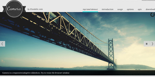 You may familiar with a slider called "Diapo", this is based on the same slideshow but with more features, of course, the responsive support.
 - Unoslider
 Fully responsive, touch enabled, mobile optimized jQuery slider plugin
 - Flexslider
 A fully responsive jQuery slider plugin with hardware accelerated touch swipe support and other features.
 - Responsive Slides
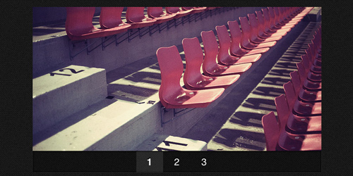 ResponsiveSlides.js is a tiny jQuery plugin that creates a responsive slideshow using images inside
- . It works with wide range of browsers including all IE versions from IE6 and up. It also adds css max-width support for IE6 and other browsers that don't natively support it.
- WMU Slider
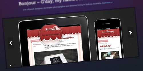 wmuSlider, a jQuery responsive slider. This is a personal project from Brice Lechâtellier thus there will be no support provided.
Useful Tools And Javascript Plugins
Also, here are a few good tools and javascript plugins that can help you to speed up the development process and also enhance the usability of your responsive layout. One thing you will definitely need is to make IE6-8 support CSS3 Media Queries. I used CSS3 Media Queries Javascript.
- PX To Em
 One of the requirement to get a fluid and responsive layout is - you have to declare your CSS size in percent or EMs. This online tools will make your life easier if you're not a fan of math.
 - Adaptive Images
 Adaptive Images detects your visitor's screen size and automatically creates, caches, and delivers device appropriate re-scaled versions of your web page's embeded HTML images. No mark-up changes needed. It is intended for use with Responsive Designs and to be combined with Fluid Image techniques.
 - Grid
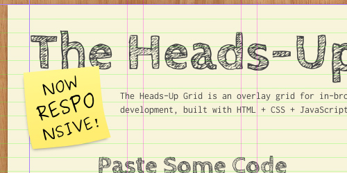 The Heads-Up Grid is an overlay grid for in-browser website development, built with HTML + CSS + JavaScript.
 - Responsive Menu
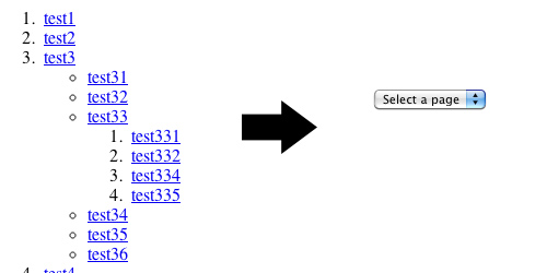 A Plugin which turns your site's navigation into a dropdown (
 - GridFox
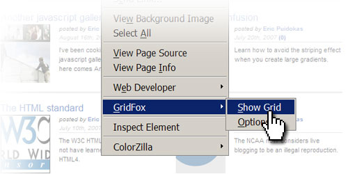 GridFox is a Firefox extension that overlays a grid on any website. If you can open it in Firefox, you can put a grid on top of it. It’s easy to customize, allowing you to create the exact grid you designed your layout around.
 - FitText.js
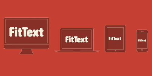 FitText makes font-sizes flexible. Use this plugin on your fluid or responsive layout to achieve scalable headlines that fill the width of a parent element.
 - FitVids.js
 A lightweight, easy-to-use jQuery plugin for fluid width video embeds.
 - Respond A fast & lightweight polyfill for min/max-width CSS3 Media Queries (for IE 6-8, and more)
- CSS3 Media Queries css3-mediaqueries.js by Wouter van der Graaf is a JavaScript library to make IE 5+, Firefox 1+ and Safari 2 transparently parse, test and apply CSS3 Media Queries.
- BreakPoints Define breakpoints for your responsive design, and Breakpoints.js will fire custom events when the browser enters and/or exits that breakpoint.
Tutorials
Here are a few of tutorials that I found and proven informative and pretty useful if you're new to responsive design. Some of them are step-by-step tutorials with well-illustrated examples and demo.
- Flexible Grid
- A List Apart - Responsive Web Design
- Sitepoint - Media Queries
- Web Design Wall - Responsive Design with CSS3 Media Queries
- Smashing Magazine - How to us CSS3 Media Queries to create a mobile version of your website
Conclusion
Like I said before, it's good to be cutting edge, but not all websites should be made responsive. You need to understand the purpose of responsive and its weaknesses before making such decision. Otherwise, responsive layout is a very good solution to taking care of users with different screen resolutions and mobile platforms. I hope this post will able to give you a kick start, I procrastinated to embrace this technology for a long time, and it's good to learn something cool again. :) Have fun!

Comments will be moderated and
rel="nofollow"will be added to all links. You can wrap your coding with[code][/code]to make use of built-in syntax highlighter.It's written in french but it's easily understandable.