Introduction
Infographics seem to be a real trend today, with new ones popping up daily on all sorts of subjects. From mortgages to ice cream, estimating software to infographics about infographics, there is very little now that hasn't been 'visualised' in some form. Many people don't realise that the term information graphic, or 'infographic' was first coined over 100 years ago, with the Coxcomb chart by Florence Nightingale in 1857 being one of earliest recognised examples. They have existed in many forms since then, but only in the past few years have infographics developed into the art form we know today.

However, they suit the information heavy world we live in as they give an easily understandable visual snapshot of something that may otherwise be plain text, and can help to widen the audience of a subject. Many of the infographics we see have been created for the purpose of marketing, branding or SEO, and the explosion of SEO services in the past few years has driven the huge range you see today. They have become especially important since the latest Google algorithm update, nicknamed Panda. The emphasis of SEO has swung towards quality links, as well as links from social media accounts (likes, shares, tweets, diggs etc), and infographics fulfil both of these criteria. They have therefore become much more popular in the past year or so for linkbuilding purposes.

But do you have to be a graphic designer to design infographics? In the past, graphic design was the preserve of the professional, but with the amount of online tools available today anyone can have a go. There are a whole arsenal of different programs online that will help you with anything from layouts to data, and all of these can be utilised by a layman with no previous design experience.
Best Practice Process
But before you look at any online tools, you should have an idea of the best practice process for any kind of design, be it graphic, product or anything else:
-
Research
Before you begin anything, you need to decide what your subject is going to be and do some reading. There is nothing worse than an infographic that presents stale, old information or worse, nothing at all!
-
Brainstorm
Once you have some hard data to work from, you need to begin to consider the design. Infographics often work best when the graphics reflect the subject of the data, so try and let the data inform and drive the design. In this part of the design process as many avenues as possible need to be explored.
-
Brainstorm / Form Concepts
Once you have outlined your ideas, try and work them together into several more coherent concepts. This is best done with at least one other person to act as a sounding board for your ideas, and to add another perspective.
-
Refine Down To 1 Concept
Continue the refining process through sketching and iterations, and gain feedback from as many people as possible. You should begin to see the finished product coming into shape.
-
Finalise
Now you have your final concept you can go about putting the finishing touches in, as well as any last minute refining that needs to be done. With infographics this usually means adding highlights/textures to really make the graphics pop.
Best Online Resources For Infographic Design
So now you know the rough process you can get the sketchbook out and start thinking about your first project. And to help, below is a list of some of the best online resources for creating whole infographics, or smaller parts that you can combine to make a larger overall graphic:
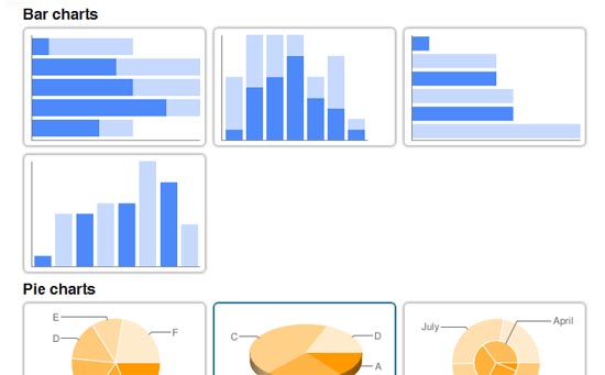
- Charts.hohli.com
Charts.hohli.com - A very simple and easy to use graph and chart generator, Hohli is perfect for making up parts of a larger infographic. A good amount of options and a great interface mean this is the place to start on your infographic journey.
![Charts.hohli.com]()
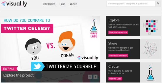
- Visual.ly
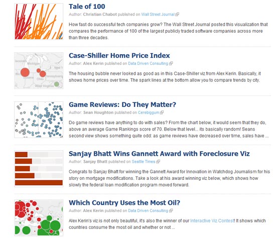
Visual.ly - This recently launched site is a massive infographic resource. Firstly it acts as a search engine for infographics on the web, however the selection is still slightly limited as they have to be submitted and approved (but with time this will improve). Secondly it allows designers exposure, as they can upload their own work for promotion and commenting. The ranking systems allows users to vote for the ones they like best. Thirdly it offers a DIY infographic service, which sadly is currently in beta testing. You can try out their 'Twitterize' twitter visualiser, which pits you against another username in infographic battle, but other services are not currently live. All in all though a pretty darn good place for infographic lovers.
![Visual.ly]()
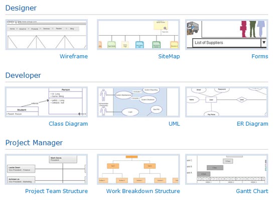
- Creately.com
Excellent graphing tool with lots of different types and display options. A great start if you're looking for some simple data display options. Creately.com/diagram-examples for examples.
![Creately.com]()
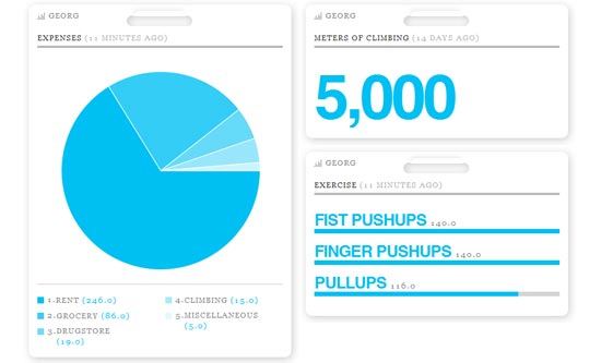
- Daytum.com
Daytum.com - collect personal data over time and display in a variety of different formats. For example www.daytum.com/boilermaker, displays of alcoholic drinks consumed. Nice clean designs.
![Daytum.com]()
- Tableau Software
TableauSoftware.com - make use of publicly uploaded data to create infographics. Done either by you with raw data or with the help of their visualisation engine. Tableausoftware.com/public/gallery for examples. Wide range of options and styles.
![Tableau Software]()
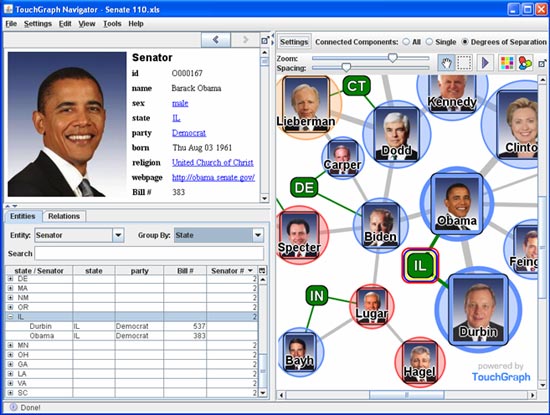
- TouchGraph
TouchGraph.com - simple graphing tool for showing relationships. Works Facebook and Amazon to map your contacts, but also with any keyword and can give an SEO based view of the sites linking to it. Touchgraph.com/seo for examples.
![TouchGraph]()
- Wordle
Wordle.net - clever tool that allows you to enter or upload a collection of words and then massages them to fit into a range of different shapes. Wordle.net/gallery for examples.
![Wordle]()
- IBM
Many Eyes - an experiment by IBM Research and Cognos to develop a data visualisation tool. It can be used to create infographics from your own data, or data sets available on the site, then can be uploaded to a public gallery for comment. Some interesting visualisation tools but a bit basic.
![IBM]()
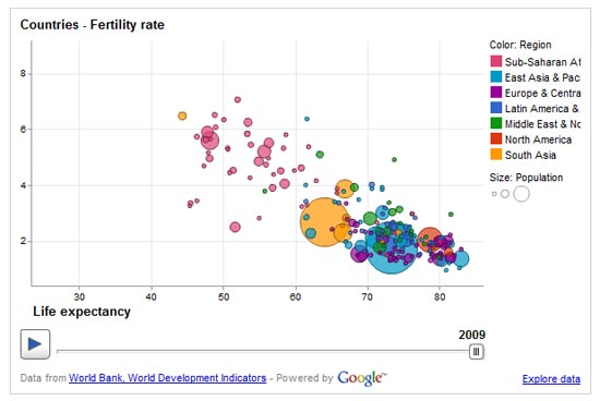
- Google Public Data
Google Public Data Explorer - an excellent and in depth tool that allows the visualisation of thousands of sets of public data of all kinds. Great not only as a source of information but as a visualisation tool as well.
![Google Public Data]()
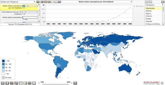
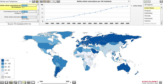
- StatPlanet
Stat Planet - pretty much what it says on the tin, if you need world statistics, visualised or not, this is a great resource.
![StatPlanet]()
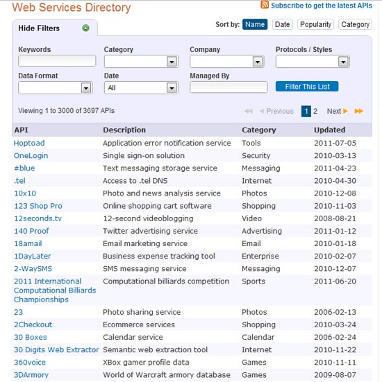
- ProgrammableWeb
API's - these are an invaluable source of data, and today are released by hundreds of sites. Whilst they are intended for developers to produce and test applications for that particular site, they can also be used as a goldmine of data. If you have a bit of programming know how, you can write scripts to access the API for all kinds of stats and info.
![ProgrammableWeb]()
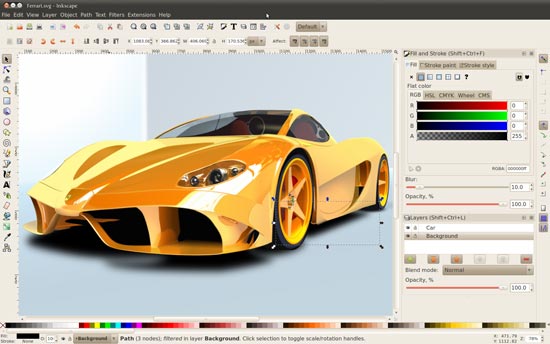
- Inkscape
Inkscape.org - a powerful open source vector graphics editing program, Inkscape is free to use. It has many of the capabilities of Illustrator and CorelDraw so is an excellent free tool that can be used. The interface is quite simple and basic, but for many this is all that is required.
![Inkscape]()

Lastly...
Whilst all of these tools are useful in helping to design an infographic, they don't do the whole job for you. Unless you have some kind of experience with image editing software and a vague eye for design you're not going to be able to do this very well. Even then, if you want a final product like some of the more complex work referenced above, you may well have to look to a professional designer. This will cost you, but ultimately you need an infographic to look good and stand out, and that's what you'll get...
Comments will be moderated and
rel="nofollow"will be added to all links. You can wrap your coding with[code][/code]to make use of built-in syntax highlighter.iCharts helps create interactive and embeddable charts online for free.
Best,
Raj