Over the last couple of months, I have been writing a book about design with my co-author Tomas Laurinavicius. This post is filled with a bunch of great advice about how to design mobile apps that came about from our research for the book. I won’t tell you that your buttons need to be a minimum 44px x 44px because by now this is a given. I will instead focus on more user experience centric advice to help you not over look some obvious things and, in turn, help you make your app just a little bit better.
Why I’m writing a book about this
Tomas and I wrote this book for a variety of reasons. We picked this topic because little is written about mobile design in the same detail as it is for website UI and UX. Mobile is growing so we wanted to know what makes for great apps. We have decided to share our findings by creating an eBook, Mobile Design Book. In the book we use examples of real apps to determine what works well in them and what doesn’t. This nitpicking allowed us to find great tips on mobile design to share with others.

Don’t over think the navigation
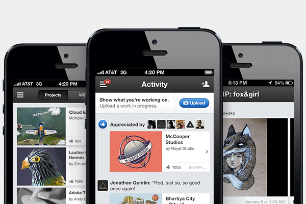
Behance is a popular portfolio website; I’m sure you’ve heard of it. Their website is a wonderful platform that allows you to do so many different things including posting a new project or browsing through others’. You can do the exact same thing using their app as you cna their website; that’s totally okay but the mobile app’s navigation pose a totally new experience.
“The navigation on their website is simple and it allows you to explore their website in various way. When you are familiar with their website navigation and then try to use their app, affordance is lost. The app navigation doesn’t reflect the same style of the website.†an excerpt from Mobile Design Book.
If you want the app and the website to have the same functionality keep the navigation experience the same too. Don’t redo it; don’t regroup links or tasks. We gave out the Behance chapter for free to our subscribers; you can read the whole chapter on navigation and Behance on our blog.
Going wild
Forever 21 has their own app where their navigation simple went wild. The clothing store provides six different levels of navigation within the app. That’s a lot of screen real estate that should be going towards their product, not the navigation. One of the navigation levels stand out specifically because they are breadcrumbs. The intention with that is good but because because it’s on a website doesn't mean it will come in handy within a mobile app. It’s okay to skip over all the things one can fit within a website. Simply put, think the navigation through carefully; some of the navigation items in Forever 21’s app are duplicates. What a waste! We all want our users to be happy and want to give them everything we can but that is simply not feasible.
“Your product should never fight for attention. What’s worse, the various navigations don’t provide much value. A lot of the functionality can be consolidated, or rearranged. Some of them repeat – the hamburger menu is the same thing as the shop icon.†an excerpt from Mobile Design Book.

Show the content in a new way
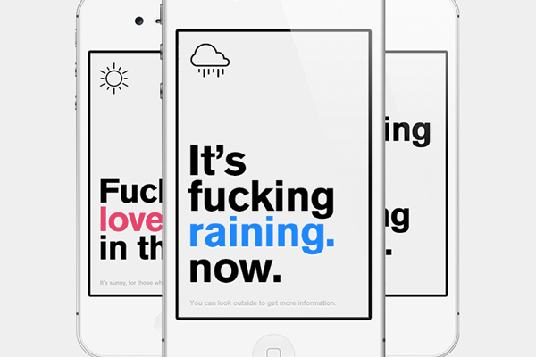
There are so many various weather apps out there; they all do the exact same thing by showing you the weather in one form or another. Some apps may be more detailed than others but that may not be good enough to separate you from competition. Authentic Weather is a fantastic example of how showing of the exact same content in a unique way can give you a competitive edge. If you take a look at the app it curses while stating the weather in a sarcastic remark. Not too many apps out there do that; this gives Authentic Weather a specific personality and makes sure they stand out from the crowd. Your app should have its own specific tone of voice and if that voice only resonates with some people that’s great; it’s okay not to have to please everyone!
“First of all, this app is not for everyone. Some people don’t like cursing and the tone the app conveys – that’s okay. I want to applaud it for not trying to please everyone. It only shows the app truly knows it’s audience and it committed to it.â€an excerpt from Mobile Design Book.
Unfortunately the chapter about Authentic Weather was cut from the book. You can read it on blog, Authentic Weather: fucking content king.
The more obvious the task flow the better
Spotify is a music providing app where you pay a monthly fee and it gives you great access to legal music. Like most music apps it gives you the opportunity to make play lists, and shuffle songs for instance; you know, the obvious music app stuff. However, some of its functionality is totally hidden! In order to figure out how to set a playlist on repeat you have to do some exploring. The same goes for shuffling a playlist. Don’t be fooled by the big green “shuffle†button atop every play list as it doesn’t turn shuffle off, and if you tap it while listening to a song it will change it too. The lessons here are plentiful; don’t hid common and obvious functionality nor make them complex. The goal is to simplify the experience and the task flow not reinvent the wheel.
“Common and simple functionalities shouldn’t be hidden away behind various taps and interfaces. Keep the obvious things upfront so they can be in fact obvious.†an excerpt from Mobile Design Book.

Obvious and simple is the way to go
Take a look at an app like Lyft where their task flow is so obvious. Lyft is a cab service app where all you can do is call yourself a cab. The app is so obvious to use it’s not even possible to call it intuitive. Although it may not be as complex as a music app it’s functionality is limited to the one thing you’d care to do: call a cab. All you need to do is press a big green button and your ride is on its way. Obvious and simple is always the goal when creating interactions. The app doesn't provide any necessary information for you; it only shows you the minimal amount of information you’d care for.
“The more obvious your app is to use the better. Give the user everything they would need from you and nothing more.†an excerpt from Mobile Design Book.
We also shared a chapter about Lyft with our subscribers. You can take a look about what we have to say in regards to Lyft and simplifying the task flow on our blog as well.

Preorder Mobile Design Book
Go to our website to learn more about it: Mobile Design Book. Also, go ahead and preorder it; we’ll even give you a discount for 25% off :) When placing the order use the code ‘queness25’ at check out to use the discount.
The book will be available August 13th! I can’t want for you to read it.
Comments will be moderated and
rel="nofollow"will be added to all links. You can wrap your coding with[code][/code]to make use of built-in syntax highlighter.