As usual, first thing in the morning, I'd read up all kind of news. From world news to the world of web development and I discovered a recently published CSS3 tutorial article titled "Arrow Navigation Styles" by Codrops. That's how I started this tutorial.
All of you should be quite familiar with Codrop's tutorials. They are really inspiring and creative. I played with the Arrow Navigation styles demo, I'm impressed. And I wondered how hard would it be to really implement it on Slider without actually create a slider that does that. First slider that immediately came into my mind is FlexSlider.
I love FlexSlider. It's easy to implement and play really well with responsive layout and all browsers. Apart of that, it has many options and most importantly a few handy callback events. With countless time of FlexSlider implementation in my client projects, I know I can integrate Mary Lou's arrow navigation styles into FlexSlider.
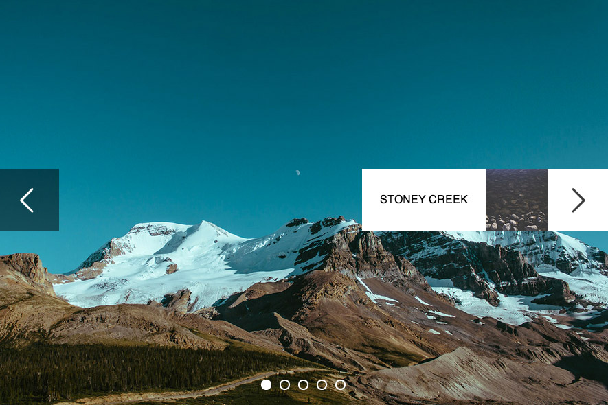
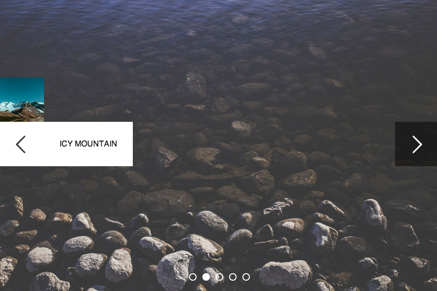
Here is the preview:
I will try to implement 4 styles with my own code, you will need CSS3 and jQuery for this tutorial.
Setup FlexSlider
First thing first, you need to know how to setup Flexslider. We won't cover it in this tutorial, you can read it from its documentation.
This is the default Slider HTML markup:
<div class="flexslider">
  <ul class="slides">
    <li>
      <img data-src="slide1.jpg" />
    </li>
    <li>
      <img data-src="slide2.jpg" />
    </li>
    <li>
      <img data-src="slide3.jpg" />
    </li>
    <li>
      <img data-src="slide4.jpg" />
    </li>
  </ul>
</div>
Once we get it running, we need to configure and add some scripts to populate some markup to FlexSlider's directional navigation so we can style it up later. By default, this is the HTML markup you'll get once the slider is running (I got it with Web Inspector).
<ul class="flex-direction-nav">
	<li><a class="flex-prev" href="#">Previous</a></li>
	<li><a class="flex-next" href="#">Next</a></li>
</ul>
Callback events
We need to add caption and thumbnail to the slider. From above, you know the HTML markup already, and below is the one we'll use:
<div class="flexslider">
  <ul class="slides">
    <li>
			<img data-src="img/full/5.jpg" alt="icy Mountain" data-thumbnail="img/thumbnail/5.jpg" />
		</li>
 		<li>
			<img data-src="img/full/3.jpg" alt="Stoney Creek" data-thumbnail="img/thumbnail/3.jpg" />
		</li>
    <li>
			<img data-src="img/full/2.jpg" alt="Narrow Road" data-thumbnail="img/thumbnail/2.jpg" />
		</li>
    <li>
			<img data-src="img/full/1.jpg" alt="Grey Sky" data-thumbnail="img/thumbnail/1.jpg"/>
		</li>
    <li>
			<img data-src="img/full/4.jpg" alt="Wood Pattern" data-thumbnail="img/thumbnail/4.jpg" />
		</li>
	</ul>
</div>
We need to add alt and also data-thumbnail for caption and thumbnail path.
Finally, we use callback events to append markup to the nav. Pretty much self-explanatory.
$(function () {

	//Initialize FlexSlider
	$('#hero .flexslider').flexslider({
		slideshow: false,
		slideshowSpeed: 5000,
		pauseOnHover: true,
		start: renderPreview,	//render preview on start
		before: renderPreview //render preview before moving to the next slide
	});

	function renderPreview(slider) {

		 var sl = $(slider);
		 var prevWrapper = sl.find('.flex-prev');
		 var nextWrapper = sl.find('.flex-next');

		 //calculate the prev and curr slide based on current slide
		 var curr = slider.animatingTo;
		 var prev = (curr == 0) ? slider.count - 1 : curr - 1;
		 var next = (curr == slider.count - 1) ? 0 : curr + 1;

		 //add prev and next slide details into the directional nav
		 prevWrapper.find('.preview, .arrow').remove();
		 nextWrapper.find('.preview, .arrow').remove();
		 prevWrapper.append(grabContent(sl.find('li:eq(' + prev + ') img')));
		 nextWrapper.append(grabContent(sl.find('li:eq(' + next + ') img')));

	}

	// grab the data and render in HTML
	function grabContent(img) {
		var tn = img.data('thumbnail');
		var alt = img.prop('alt');
		var html = '';

		//you can edit this markup to your own needs, but make sure you style it up accordingly
		html = '<div class="arrow"></div><div class="preview"><img data-src="' + tn + '" alt="" /><div class="alt">' + alt + '</div></div>';
		return html;
	}

});
Once you refresh and run that script, this will be the new markup for the nav:
<ul class="flex-direction-nav">
	<li>
		<a class="flex-prev" href="#">Previous
			<div class="arrow"></div>
			<div class="preview">
				<img data-src="img/thumbnail/3.jpg" alt="">
				<div class="alt">Stoney Creek</div>
			</div>
		</a>
	</li>
	<li>
		<a class="flex-next" href="#">Next
			<div class="arrow"></div>
			<div class="preview">
				<img data-src="img/thumbnail/1.jpg" alt="">
				<div class="alt">Grey Sky</div>
			</div>
		</a>
	</li>
</ul>
CSS3 Animation
For the animation we will heavily depend on CSS3. As a result, please note that this tutorial will only work in modern browsers. I tested it on Chrome, Safari, Firefox and IE10. Also, responsive layout will require additional styling. Lastly, similar with Codrop tutorial, it's not a solution for touch devices.
Below is the styling for Slide Out. We add transition to .preview and by change left and right properties, we will able to slide the content in and out easily.
/* general style */
.preview {
	width: 360px;
	height:90px;
	position: absolute;
	top:0;
	left:-90px;
	z-index:100;
	-webkit-transition:  all 0.3s ease-out;
	-moz-transition:  all 0.3s ease-out;
	transition:  all 0.3s ease-out;
	opacity:0;
}

.preview img {
	position: absolute;
	left:90px;
	top:0;
	width: 90px;
}

.preview .alt {
	position: absolute;
	left:180px;
	top:0;
	background: #fff;
	width: 180px;
	height:90px;
	color:#000;
	text-indent:0;
	text-transform: uppercase;
	text-align:center;
	font-size:16px;
	line-height:90px;
	-webkit-box-sizing: border-box;
	-moz-box-sizing: border-box;
	-o-box-sizing: border-box;
}


/* next button */
.flex-next .preview {
	right:-50px;
	left:auto;
}

.flex-next .preview img {
	position: absolute;
	left:180px;
	top:0;
	width: 90px;
}

.flex-next .preview .alt {
	left:0;
}


/* hover style */
.flex-prev:hover .preview {
	left:0;
	opacity:1;
}

.flex-next:hover .preview {
	right:0;
	opacity:1;
}
And below is CSS for simple Flip Out animation. Flip Out will be more complicated because it involves 3D transform. We need to set a few properties such as perspective-origin, perspective, transform-origin etc, to ensure it has nice 3D flipping effect.
/* general style */
.preview {
	width: 90px;
	height:90px;
	position: absolute;
	top:0;
	left:90px;
	z-index:100;
	-webkit-transition:  all 0.3s ease-out;
	-moz-transition:  all 0.3s ease-out;
	transition:  all 0.3s ease-out;
}

.preview img {
	position: absolute;
	left:0;
	top:0;
	width: 90px;
}

.preview .alt {
	display:none;
}


/* prev button */
.flex-prev {
	-webkit-perspective-origin: 100% 50%;
	perspective-origin: 100% 50%;
	-webkit-perspective: 1000px;
	perspective: 1000px;
}

.flex-prev .preview {
	-webkit-transform: rotateY(90deg);
	transform: rotateY(90deg);
	-webkit-transform-origin: 0% 50%;
	transform-origin: 0% 50%;
}


/* next button */
.flex-next {
	-webkit-perspective-origin: 0% 50%;
	perspective-origin: 0% 50%;
	-webkit-perspective: 1000px;
	perspective: 1000px;
}

.flex-next .preview {
	right:90px;
	left:auto;
	-webkit-transform: rotateY(-90deg);
	transform: rotateY(-90deg);
	-webkit-transform-origin: 100% 100%;
	transform-origin: 100% 100%;
}

.flex-next .preview img {
	position: absolute;
	left:0;
	top:0;
	width: 90px;
}


/* hover style */
.flex-direction-nav a:hover .preview {
	opacity:1;
	-webkit-transform: rotateY(0deg);
	transform: rotateY(0deg);
}


/* different hover style for flexslider nav */
.flex-direction-nav a {
	-webkit-transition:  none;
	-moz-transition: none;
	transition:  none;
}

Conclusion
Codrops surely inspired me in a few ways. Sometimes I wonder how on earth you can come out with such creative solution for a simple thing! Here you go, creative Arrow Navigation styles being implemented in actual working sliders. I'm sure you can do more than these and more crazy transition. I hope this tutorial will able to help you understand it's possible to create custom slider with its callback events.
Make sure to follow us and tweet about this if you like it. Stay tuning in for more tutorials.
Comments will be moderated and
rel="nofollow"will be added to all links. You can wrap your coding with[code][/code]to make use of built-in syntax highlighter.can you please tell me the way to make this slider's slides automatically...
http://www.queness.com/post/16977/create-animated-arrow-navigations-with-css3