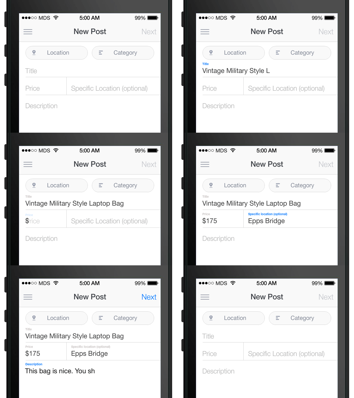
Today I want to walk you through a story about the float label pattern. I can’t speak to who thought of this first, but I can say that Matt Smith popularized it with one of his Dribbble shots a few months back. It is a new take on the way input fields and placeholders behave when a form is being filed it; it is actually a pretty smart usability technique.
So let’s talk a little bit about what the user experience and design side of things are and then let me show you how you can code this up yourself.
A little background on this idea
Matt Smith had an idea a while back about how to improve input fields on mobile devices. As he explains in his blog post, he first experimented with the same concept where the placeholder changed into an icon but that did not stick. He felt this was not good enough; the icons were not clear enough, they did not convey the message of the placeholder/label well enough. Matt then just decided to make the text move up. You can read all about his though process on Matt’s blog.
The ux side of things
The float label pattern is quiet a brilliant solution to placeholders in both, mobile and desktop, because a lot of designs default to sole placeholders with no labels now-a-days. This can be very dangerous as people will forget what it is that they are typing. I’m hoping that nothing will ever explode – not that type of dangerous – but people will make errors and mistakes. As a designer it is your responsibility to help them, which is why I am against lableless inputs. This is especially so as to why I love this float label pattern approach.
Some of the reasons as to why you would not use labels are to save space, or to improve the looks of the form. Additionally, some designs include icons in addition to the placeholders; this does in fact help you when the placeholder is gone as there is an icon to help out now. Just like Matt concluded, that is not always good enough; what is the icon is not obvious or is poorly designed? However, Matt’s solution gives you a placeholder with no label for the design aesthetics and a label text once you start typing for usability purposes; this is possible by animating the placeholder to be the label. Brilliant!
The code
I have found the perfect snippet from CodePen by Jesse Shawl that creases this exact effect. I would like to explain the code for you that goes into making the float label pattern.
The HTML
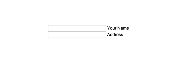
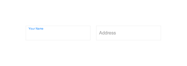
First and foremost, we need to have a form in our HTML. Checkout the code below and insert it into your page to get started. Note that we do in fact have an input with no placeholder and a label. The way the code works is, it makes it seem as though there is an animated placeholder while in reality it is the label. It is easier to manipulate a label then it is a placeholder, which is why we are doing it this way.
<form>
  <div class="input">
    <input type="text" id="name" />
    <label for="name">Your Name</label>
  </div>
  <div class="input">
    <input type="text" id="address" />
    <label for="address">Address</label>
  </div>
</form>
The CSS
Unfortunately, the CSS is the most complex aspect of the snippet, so let’s go over it little by little.
form{
  margin: 5em;
  backface-visibility: hidden;
}
.input{
  position: relative;
  float: left;
  margin: 10px;
}
input{
  border: 1px solid #eee;
  padding: 1em .5em;
  outline: none;
}
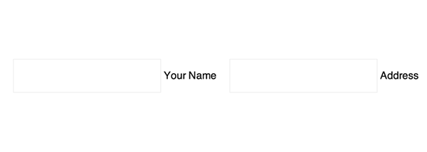
In the above code you can clearly see that we are just defining the styling of the input fields. Nothing special is going on in that part of the snippet. However, when you look at the CSS below, you can now start to see how the animation is going to take shape.
The rule below, input + label, you see that we are styling the first label after any input. The most notable of definitions are that the label is now positioned absolute compared to the input and that vertically aligned in the middle of the input. Additionally, we have a transition set on the label where it will animate for .2 seconds if any property is changed. Transition set to all will animate any changed properties, rather than any specific one. It is helpful in this situation as we are editing multiple properties: the position, the size and the colour of the label.
input + label {
  position:absolute;
  left:10px;
  top:50%;
  transform:translateY(-50%);
  color:#aaa;
  transition:all .2s ease;
}
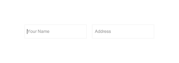
Now, we are setting something cool. We are saying that if the label is on focus – meaning that the field is selected – we want the colour, font size and top location to change. We are also canceling out the transformation from translateY(-50%) to none.
input:focus + label, {
  color: #52A5FB;
  font-size: .65em;
  top: 8%;
  transform: none;
}
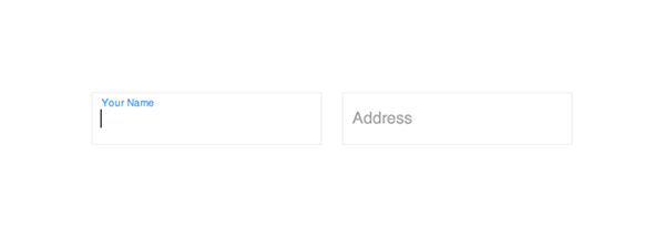
The little rule below simply sets the label to look like a typical placeholder by making it a light gray colour. You will see how the .not-empty class will come in handy once we have the JavaScript in place.
.not-empty + label {
  color:#aaa;
}
The JavaScript
For those of you, who are not that comfortable about JavaScript, please don’t be worried. I am actually not that great with it myself but this is some very simple stuff. The first line of code simply grabs the input in our form - easy.
var inputs = document.getElementsByTagName('input');
Now we have a for loop which basically states that every time there is a click on the input – like when you select it to type into it – or when you actually type into it, run the function called bindUI.
for( i=0 ; i<inputs.length; i++ ) {
  var input = inputs[i];
  input.addEventListener('keyup',bindUI, false);
}
And here, we are defining this function we just called. bindUI works as follows, if there a value in our input, add a class a class called a call .not-empty to the field. I don’t want you to get confused; by ‘not empty’ Jesse implies that there is a placeholder, not that there is nothing typed into the input itself.
function bindUI() {
  if( this.value ) {
   this.classList.add('not-empty');
  } else {
    this.classList.remove('not-empty');
  }
}
The github repo
Jared Verdi was actually the first to implement the design into code. He created a Github repo, which you are welcome to fork and use; follow this link to do so. You should check it out if you prefer to see this in Objective-C, like for your mobile iOS app, instead of JavaScript.

Comments will be moderated and
rel="nofollow"will be added to all links. You can wrap your coding with[code][/code]to make use of built-in syntax highlighter.