While the existence of grid-based design approach for the print dates back to the post-world war era, it has started to gain popularity in the web design recently. Grid-based website offer a visual balance and a hierarchy of importance often eliminating anarchy and confusion.
Given the right execution, gird-based websites can render well across various platforms including PCs, smartphones, and tablets. This diversity is becoming important as people use different devices to access information on the Internet. But does this approach always work? This article discusses the evolution of gird-based website, its advantages and best practices.
Grid-based layout allows you to infuse structure and form into your website. A grid system comprises of a series of intersecting horizontal and vertical lines used to arrange and streamline content. While grid system in print traces its roots back to the World War II era, it is now used increasingly in websites. This design approach is undoubtedly one of the most powerful methods that helps overcome what we call a “designer's block.†Well, it is not easy creating designs at your own sweet will. Sometimes ideas seem to be elusive forcing you to stare a blank computer screen for hours. Grid-based websites often comes to the rescue of designers, allowing them to achieve consistency, making content easy to scan and manageable. One of the most powerful tools at a designer’s disposal, grid-based layout streamlines chaos and helps create a website that users will find easy to navigate, intuitive, and easy to decipher.
Grid in graphic design
“The grid system is an aid, not a guarantee. It permits a number of possible uses and each designer can look for a solution appropriate to his personal style. But one must learn how to use the grid; it is an art that requires practice. †- Josef Müller-Brockmann

Ever since the medieval times, simple version of simple grids were extensively used to arrange handwritten text on pages. Villard Diagram serves as a classic example. Post World War II, several graphic designers, such as Max Bill, Emil Ruder, and Josef Müller-Brockmann deeply influenced by The New Typography began to devise a new system that would achieve the purpose of achieving coherency in organizing the pages. As a result, the modern typographic grid became associated with the International Typographic Style. The core essence of these ideas were presented in the book Grid Systems in Graphic Design for the first time by Josef Müller-Brockmann, helping to spread the knowledge about the grids first in Europe, and later in North America. The typographic grid continues to be taught today as a useful tool for projects even today.
Grid-based layout: Making inroads into website design
Recent years have witnessed phenomenal increase in grid-based layout for websites. While website design frameworks producing HTML and CSS existed for sometime, newer frameworks heightened interest level in grid-based layouts. With such tools, designers can offer sophisticated layout that enhance the visual experience. Consistency of the page takes user engagement to the next level. On the other hand, it is relatively easy for developers to update the layout effortlessly in a consistent manner.
Grid revolution: Think beyond squares
But gird-based website is not about mindlessly stuffing your web page with squares. It is about proportion. In literal sense grid is of X by Y pixels where all elements are placed on the cell border lines and aligned on horizontal and vertical lines.
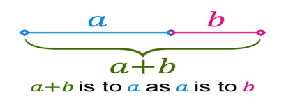
Designers often consider divine proportion helpful in giving logical guidelines for layouts which are both attractive and unique. The golden ratio or divine proportion is commonly used in everyday designs. In mathematics and the arts, two quantities are in the golden ratio if their ratio is the same as the ratio of their sum to the larger of the two quantities, i.e. their maximum. In simple terms, you take the total width of your content area and divide that by 1.62. But this is about design, so I would not delve further into numbers and calculations. The big question is how does this proportion relate with design? It is widely believed that compositions divided by proportionate lines according to the Golden rule look aesthetically appealing.
Rule of the Thirds

For those who get easily bogged down by numbers, there is a simple version of the Golden Ratio. It is known as the Rule of the Thirds. According to this rule, you’ll get 9 grids if you divide any given image into thirds both horizontally and vertically. The ideal placement for points of interest are the vertices of the lines. Most people view things placed at the points. Furthermore, such division makes the page easy to scan. You can break down those thirds further for complex design.
CSS-Based Grid frameworks
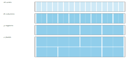
While you don't always have to abide by grid formation, it is important to understand the intricacies of grid systems. There are several CSS grid frameworks and tools available which allows you to roll your own grid systems. The 960 Grid System (960gs) is probably the most widely known frameworks and renders well on most devices and bowers. Started by Nathan Smith, the system allows to choose from a 12, 16 and 24-column grid.
Remember it is entirely on you to select a particular framework.
Grid system works wonders: But is it right for me?
Let's you balance: Grid-based layout is all about striking a perfect balance between various design elements. You can design in proportions which allows you to maintain consistency. The complexity of some sites necessitates different page designs. But nature of some sites will demand more structured and uniform look. Ultimately, uniformity makes coding very easy. However, grid-based layout could often be very restrictive and overbearing. Ideas get buried in grids and one stops looking beyond squares and boxes. Gird websites are about correct implementation. Don't try to mindlessly squeeze all your content into grid. If frameworks don't suit you, think different. Customize and design your own grid that will meet your requirements.
Always remember these pointers:
- Should be user centric: Control your temptations and don't get carried away by aesthetics. Grid layout should focus on functionality and tackle challenges faced by both organization and end user.
- Don't try too hard: It is important not to try to force every design element within the grid. Grid is often misconstrued. Avoid treating it as a tool to control user. On the contrary, grid should enhance user experience.
- Simplicity is new sophistication: Complexity kills. A designer should try to create simple grids. Your calculations should be precise and easy to explain others. Don't get overpowered by complexity of numbers and formulas of grids.
Comments will be moderated and
rel="nofollow"will be added to all links. You can wrap your coding with[code][/code]to make use of built-in syntax highlighter.