Nowadays, everything is about interaction. Everything around us (devices, screens, content, viewports, etc) is changing; and we must adjust to this digital dynamics in order to go hand by hand with the evolving trends.
Changes arise because design is based on grids, which are the only tool that can ensure both structural and visual harmony in the digital world.
Sophisticated and well-executed layers improve the visual experience, and they are very flexible. Thanks to them, everything on a website looks consistent; and there is little modification to be applied on the layers.
Still, finding and applying the appropriate grid system is not an easy task. There are many facts and important rules that need to be followed; and a lot of technical knowledge to be adopted before launching a design project. Â
What is a grid system in web design?

Generally speaking, grids are a technical solution for web chaos. They provide reliance and harmony for what would otherwise be a bunch of unorganized information.
This is why grid systems assist the communication with users; and they help designers convey a clear message.
Thanks to grids, you don’t have to arrange elements by their importance, but simply to employ some visual hierarchy; and to establish intuitive relationships that are seen rather than explained.
Let’s be a bit technical: grid systems are net structures, built from numerous lines (both horizontal and vertical) which interact in order to arrange content properly. A good grid system gives structure to a website; and it makes content clear and readable on every page.
Honestly, gridding doesn’t leave a lot of space for innovations and creativity-you need to learn the basics and to work with simple tools before you come up with your own layouts.
The basic concepts which you should have in mind are proportionality, symmetry, balance, and emphasis.
Why use grid systems in web design?

There are two main reasons: structure and balance. There is no better way to ensure you’ll organize your content in an understandable way, which will not need modification in every occasion.
When they are well-executed, grid systems add an ‘intuitive touch’ to your design, which helps users move and predict results without losing time or making efforts.
Gridding will also help you appear more professional since you’re applying logical methods to plan the layouts of your system.
Grid systems as fundamental toolsets

Why are they so important? Is it really so meaningful to intersect few lines on your website? Isn’t it just a personal preference of the designer whether to apply them or not?
Well, you might even skip them if you think that’s fine, but it would automatically mean you’ll have accessibility troubles; delays; and similar difficulties.
Grid systems may not have been so important in the past, but they are definitely the core of today’s technical advancements.
Nowadays, online presence is completely calculated (you know what, when, and how people are checking on their devices); and grid systems are essential in order to provide a structure which can comply with the requirements.
As we already said, thanks to grids you could be consistent, flexible, and provide a balanced and well-organized content.
How to use grid systems
Think about your design’s grid and make a great layer that can display it. You can use Photoshop or some other graphic software to design it and to lock it. Further on, you could also modify it and toggle on.
For instance, you can use canonical grids to modify the placement and the size of your elements and static layouts. Grid boundaries are welcomed for extending short elements, while multiple grids or grid units are spanned by larger elements.

This is how you use grids to ensure you have consistent and stable alignment relationships.
When it comes to dynamic layouts, you need to calculate the smallest size that can be incorporated in the layout, or apply a more complex solution, such as re-computing layouts to make them suitable for displaying smaller elements.
Don’t forget that your hands are still tied: gridding should be performed with precaution and restrictions.
You may think restrictions come naturally because of the difficulty of the process, but it is not like that, without knowing them, you could go too far and lose focus from the important aspects of your design.Â
The pros of using grid systems
There is a large list of reasons why you should apply exactly grid systems. To start with, gridding helps you plan the functionality of your design; but it is also there on every stage of your development, managing the performance and providing stability for the future.
The biggest advantage, however, is that grids enable proportional and flexible design; and they balance between all the elements you have on your website.
Whatever you do, keep grids flexible so that they will respond to every modification you might need in future.
Grids are the best content organizers
One of the main reasons why designers rely on grid systems is that they want their website to look clean and organized, with all elements aligned in a logical manner.
But how do grid systems contribute to alignment? In fact, they perform it; and they spare designers’ manual efforts. Employing grid systems equals to employing a pre-made structure, which aligns your elements and keeps mess away.
Grids create both harmony and disharmony
Grids are harmonious tools, which aim to achieve balance, order and symmetry. However, applying them in a specific manner could provoke the absolutely opposite effect, namely disharmony.

You would wonder: Why does someone need to imbalance their structure? Why would he mess the perfect environment up? It is quite simple-to obtain an interesting result and to attract attention!
If controlled properly, chaos can make your website interesting and entertaining. It can insert that sense of mystery, which inspires users to ‘follow’ your story.
They will be thrilled, and they will enjoy every step of the experience, anticipating an even bigger surprise. A clean and peaceful environment may inspire trust and appreciation, but it can never keep users onboard for as long as fun does.
Therefore, break the grid and go beyond perfection! We’re sure this is not the first time you’ve been tempted to overlook the rules; and to add chaos and personality to boring online environments.
Universal application
True-grids are most convenient for editorials, magazines, and news providers, but these are not the only places where they are being applied. The real truth is that almost every design project functions thanks to them.
For instance, some of the best-executed logos were designed with grid systems (the Braun logo, for instance). Grids don’t simply construct logos: they keep them clean, consistent, and interesting. Oftentimes, grids help the creation of a masterpiece.
Grids and types are the perfect combination

These two important toolsets go hand by hand to make the perfect design. Grid systems are in charge of ‘calming’ type-heavy layouts; and they make the body copy more reader-friendly.
How do they actually improve legibility? They perform a process called ‘baseline gridding’, which introduces straight horizontal lines for every type in your design, similar to the ones that can be found in a notebook.
Thanks to these lines, you’re able to position text; and to align text boxes exactly where you need them.
The importance of rows
Horizontally positioned layouts are quite new in web design. They are becoming more and more popular, especially when applied on the home page.
Designers consider them as the most creative solutions, because the web is absolutely overwhelmed with vertical designs.
If you want to stay updated and to follow the trend, you should use more rows; and create join areas of rows and columns to make the most of your display space.
Why are rows so beneficial? They can achieve the best visual division of content in a seemingly natural flow. From a designer’s point of view, rows create opportunities for constructing new columns that differ in number, size, or position.
As we mentioned, designers also join rows and columns in order to make their layouts look more interesting.
In addition, frequent application of rows and horizontal backgrounds introduce a visual illusion that the vertical layouts you’ve employed are large and significant. Thanks to this ‘secretly’ created space, layouts stand out and gain importance. Long story short, rows are the key to proper navigation and emphasis.
Final thoughts

There are many ways to make grid systems more interesting. First of all, learn more about gridding and apply it efficiently.
Avoid rigidness and add some ‘free-flowing’ space within the design. You’re also welcomed to break the rules and to focus on a specific element: rare concepts, such as disharmony, misbalance or asymmetry can produce interesting results and they can add life within your design.Â
You may not be the biggest grid fan ever, but you cannot deny their power and their popularity.
They can be very useful, because they add flexibility and balance to the design; but also because they can make it fun and interesting and add some cool effects.
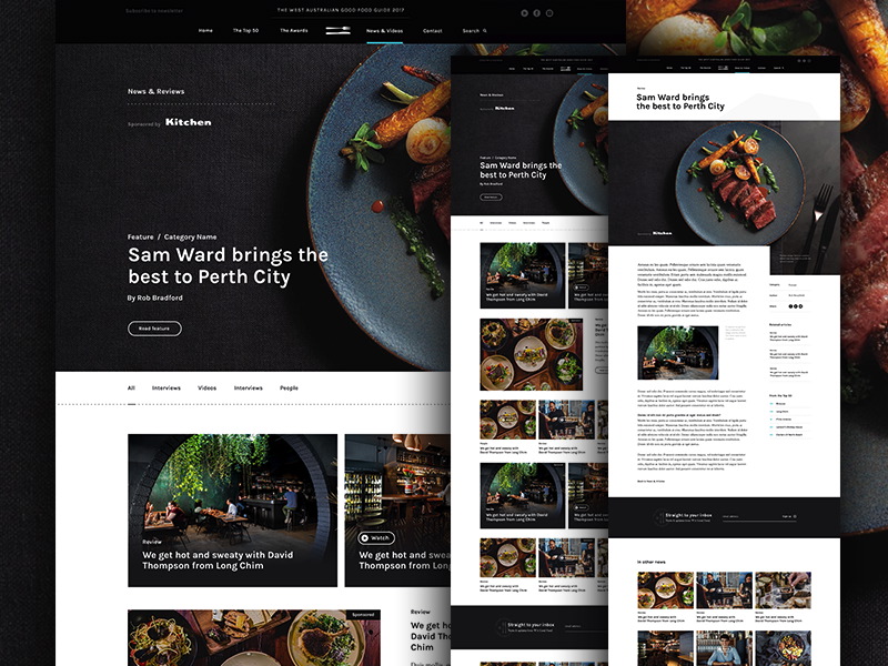
In fact, they are quite basic for modern web design, as they work on both structure and performance; and they almost always lead you to the desired results. Check out how top startups use them to organize their information.
Comments will be moderated and
rel="nofollow"will be added to all links. You can wrap your coding with[code][/code]to make use of built-in syntax highlighter.