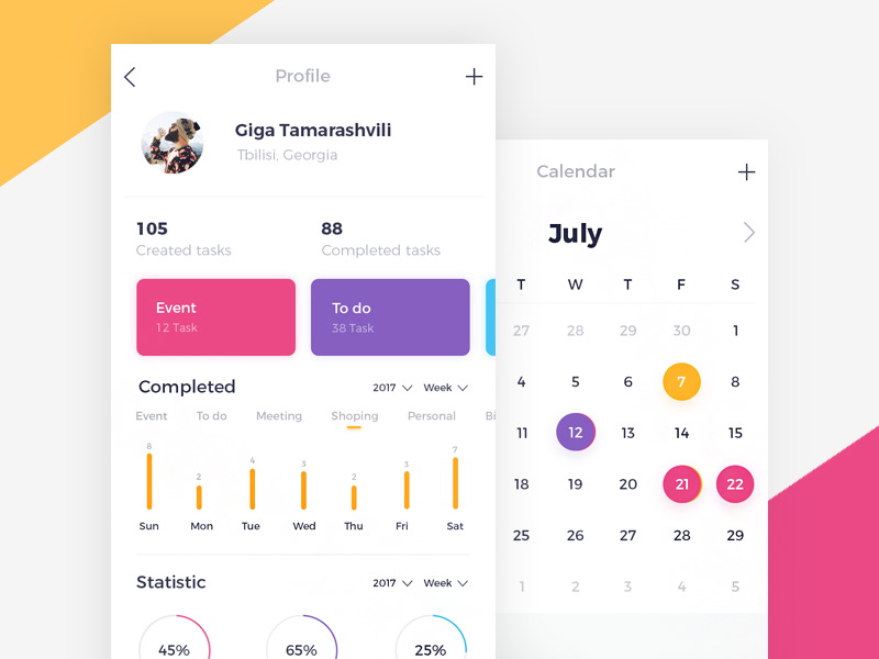
User interface design owns its importance to two basic reasons.
The first among them is intuitiveness, which makes UI easy to use and less expensive to make (there will be no training/tutorial costs).
The second one is usability-great and responsive interfaces satisfy users, and they are more likely to be used than poorly designed ones. Â
Let's check some basic UI design techniques that can help you generate more conversions:
Â
Proper spacing
At first sight, there is not much typographers could contribute with to app design. However, while they're coping with limited font choice and narrow, standardized rules, they're still in control of web tracking.

By tracking, we mean adjusting the space between letters.
This property becomes really effective with careful and tasteful application. As a result, it can improve the appearance of the headlines and the entire app/website.
Â
Focusing on key functions
Not every control you're going to offer to your users is equally important to them. For instance, when their purpose is to create a new item, users should always be able to find the 'Create', 'Save;, or 'Cancel' buttons.

'Create' will obviously be the most applied one, so you should focus more on this button than on the other ones we mentioned. How could you do that? Place the button where the user can tap it easily; fill it with some bold color; or simply make it bigger. The aim is to make it look more important than the other buttons.
There are also applications which create input action buttons, and leave the canceling option in the background. It is an excellent user interface technique, as it enables users to find exactly what they are looking for.
Â
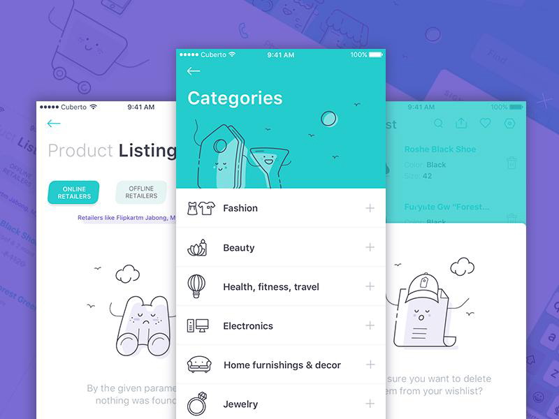
Preferring icons to textual content

The first step towards a simple user interface is the reduction/elimination of useless or rarely applied content.
This doesn't only refer to items, but also to textual labels which take a lot of space and time to be understood.
Do you really need all that text? Could your users understand your message without it? Most of the time, they need a recognizable icon instead of long and unnecessary messages.
Â
Applying smart color schemes to grab attention
Colors are not just the stylish tool of your brand. They are also effective means which attract users' attention towards important actions.
Take the US presidential campaign as an example. Most of the candidates' web pages are vividly red, because this color is known to maintain focus and to create warm and welcoming feelings.
Other naturally bright colors which have the same power are yellow and orange. They are also capable to create an optical illusion of expansion, if used on the same page with their colder counterparts (blue or green).
Therefore, warmer colors are applied for buttons and central elements, while the colder ones fill the background space.
Â
Introducing upgraded status for registered users
If you are designing a website/app that offers more than one subscription plan, make it as simple as possible for users to upgrade on a higher one.
What users usually do is trying the basic version; and if it proves to meet their expectations, they upgrade to a better plan.
As their host, you need to make this transition intuitive and easy.
Â
Using space to indicate a relationship
Experienced designers know that white spaces between elements (buttons, navigation bars, headlines, articles, etc.) are important elements on their own.

They can be transformed and manipulated in order to indicate interrelation between pairs/groups of items.
Take articles as an example-a header standing close to a larger text block is perceived as being related to the text. On the other hand, sentences placed further from the text block are obviously not related to it.
Â
Logins and Signups should be on the same page

Everything starts when a new user opens your app for the first time.
You need to prove the efficiency of your work from the very beginning. Add a sign-up option next to the log-in ones; and provide users with a simplified registration process.
What you want to avoid is a bunch of confused users, trying to register to use 'non-basic' features. Â
Also, make sure you use the best practices for login and register screens. This is one place where following norms is indicated.
Â
Effective wording and messaging
Don't underestimate the importance of textual content. At the end of the day; it is the primary informative source for the users.
Poor wording leads to poor experience and inefficiently conveyed messages. Therefore, you should consider long and well-structured sentences instead of coded abbreviations; and enable users to understand what your message is about.
Your messages should sound friendly and they should imply that users are in full control of the action they are performing. Proper messaging, however, can be challenging. You need to balance between good and precise wording; and easily understandable content.
For instance, you should choose the more appealing option between 'You inserted the wrong information' and 'The account number should be six digits in length'.
Further on, you have to preserve consistency between separate messages-they need to be equally well-worded and to sound as if they were sent by the same person.
Â
Expanding forms
We're all familiar with web's file uploading fields. They appear in many different forms: small buttons, browsing magnifiers, or side bars. However, think of a situation in which a user is trying to upload more than one file. Yes, you could replicate the uploading item five or ten times, but you cannot do that indefinitely. That's exactly when expanding forms come on the scene.
How do they work? Once a single file is uploaded, following fields will be generated automatically. In fact, every input technique could benefit from this method.
Why are they necessary? Imagine a situation where you have to add numerous email addresses in order to invite a bigger group of users. With expandable forms, you'd need only one field to start with. As a result, your interface will become simpler and better-organized.
Â
Ending thoughts
Summing up, simplicity is the master of user interface tips. Simplicity enables you to provide clear, understandable, and intuitive content.
Due to our human nature, we all dislike complexity and we try to avoid it as much as possible in our hardware/software experience.
The reality is we all have to spend some time in order to figure out how an app works, but we are not ready to waste hours and effort to decode it. Satisfied users = successful app.
An additional benefit of simplicity is proper content organization. The more we divide our content in smaller parts, the more manageable it will become.
Therefore, think about removing items, rather than adding new ones. A smaller number of elements don't decrease the power of your interface. It simply makes it more accessible.
Comments will be moderated and
rel="nofollow"will be added to all links. You can wrap your coding with[code][/code]to make use of built-in syntax highlighter.