If your visitors cannot tell what your company deals with as soon as they visit your website, then you need to make some changes in your website's strategy and layout. A website should clearly communicate what your company is about.
Some websites have very high bounce rate. It means that some various crucial elements are causing the problem.
Here are the tips that will help you get started on your website.
Come up with a Plan

A good website doesn't start with just rushing in designing it. If you want a website that easily helps your visitors, you should consider your visitor's time on your website and come up with a plan to make that visit to be a customer.
In your plan, come up with good content they will read, the pages to view and also come up with good offers to make them consider your deals. When you understand these details, it will help you come up with a great website.
Your website should take the visitor in a sequential manner and give them the right content. Use your customer's information and figure out what made them be your visitors and use those details come up with a good strategy.
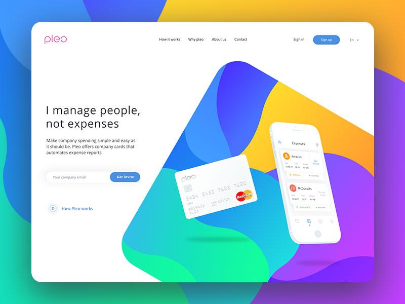
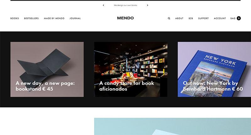
Use Graphics Appropriately

Some web pages tend to have a lot of graphics.
These overused graphics which may seem cool increase your website's loading time and yet don't serve any purpose. However, using graphics is ideal in some cases so as to improve your pages. Some of these cases include:
- Title bars – useful when you want to know the current page you are on.
- Logo – a logo represents the brand and it is useful since it adds visual appeal.
- Photos – photos make a website more attractive.
- Horizontal rules – used to differentiate between different sections and categories of a page.
- Background images – make the website attractive and user-friendly.
- Navigation icons – some navigation icons such as 'back' and 'home' are good for your page since most people are familiar with and a visitor will expect to see them on a web page.
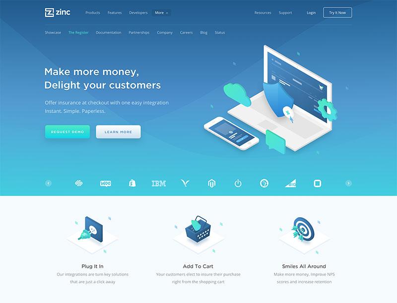
Get a professional logo and place it on the homepage

Just like the brand is crucial, your logo is equally important. Therefore, ensure that your logo stands out from the site. To make it prominent, ensure that it is situated on an upper left corner of any page and use a high quality image.
Apart from that, it is also recommended that your logo should be linked to the homepage so that when clicked on it, it navigates to the home page.
Character count matters
Make sure that your visitors can easily read the contents of your web page. This has to do with the character count and it is widely accepted that 45-75 characters in each line allow for comfortable reading.
If you want to know if your fluid design supports the character count, create a dummy text on your web page and place an asterisk in place of character 45 and 75.
After doing that, go ahead and test the page if it resizes within the parameters set.
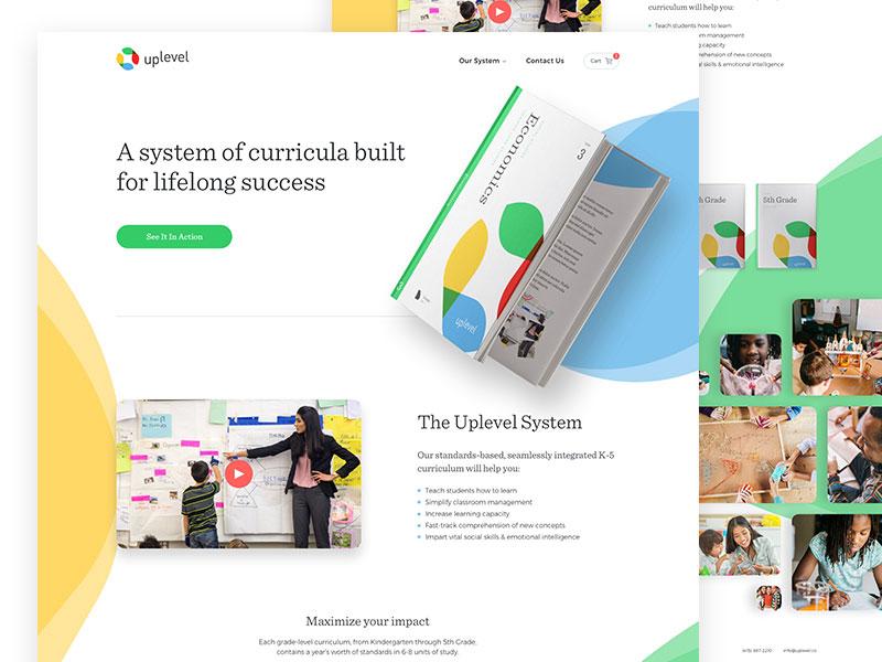
Avoid putting everything on the homepage
Most websites tend to have a lot of things on the homepage when it is designed.
Some websites are full of images and words and when a visitor comes to the site, they want to get out of the page as soon as possible.
Create a visual hierarchy of your elements and put only the essential items in your website's header. Then, add below the fold the remaining items in their order of importance. Stop worrying that visitors won't scroll below the fold.
Good backgrounds
The appeal of a website sometimes depends on the background's color and texture. It can be distracting to a visitor when the background is filled with a lot of graphics and texture. This makes images and text less noticeable.
The background color should balance well with the text to avoid compromising on readability. After all, your website is meant to give the visitors the necessary information.
For instance, a website whose background is white and text black can never compromise on readability. Some colors such as yellow and red should be used with caution. Some of these brighter and darker colors lead to visual fatigue and therefore the reader cannot concentrate on the text.
Offer only limited choices
Some websites offer very many choices for the user making it complicated and intricate. Well, it may work well for some companies, but doesn't mean it will work for you.
When a visitor is presented with many choices, he/she may find it hard to make a decision and may navigate away from your site.
Work on the title tags and the context you have
You need to optimize your title tags if you want an improvement in your sites' organic ranking. A search engine uses these title tags and when you have them optimized, search engines easily know what a page is talking about. With the improvement in the organic ranking, you can quickly increase click through.
Creating new content for your website isn't necessary when you haven't optimized the content you have. You should work on the existing content and make sure that they are optimized. To do that, use header tags when necessary, having Meta description for every page and adding title and alt tags to images. These steps can bring out a huge difference.
Make the copy simple
Surfers don't read everything on the website. A web copy should be easy to understand and should not contain a lot of information.
If the content is complex, surfers will navigate away from your site. So, the content on the web page should go directly to the point.
Add follow and share buttons
Sometimes your visitors would like to share the content of your website and you should offer them that opportunity.
You should add this follow and share buttons to every page which include landing pages, homepage, marketing emails and blog articles.
Have an intuitive navigation
There are primary navigation options and are usually in the menu bar on top of a website.
Apart from that, there should be secondary navigation options. This secondary navigation should be placed on the side bar or below the primary navigation bar.
When a website has a confusing layout, the audience will easily quit a page. Less important links should be placed at the bottom of your page while important links should be at the top of the landing and home pages.
Concentrate on call to action
You should clearly know what you intend to communicate with your visitors.
Your website should clearly show a call to action and you should focus on that. Make changes on that call to action so that you may know the graphic, color, and verbiage that converts the best.
Comments will be moderated and
rel="nofollow"will be added to all links. You can wrap your coding with[code][/code]to make use of built-in syntax highlighter.