The Internet has changed greatly in just the past few years alone. Search engine optimization rules have been changed, social media is integral to the success of a website and design aspects have evolved for mobile devices.
In other words, everything you know about web design in 2010 should be tossed aside for today's world of website development.
Here are five important points we will cover for today:
-
Top notch user experience
-
Website is scannable
-
Make it simple
-
SEO actions already installed
-
Is there a clear Call to Action (CTA)?
Â
Top Notch User Experience
A website is meant to accomplish a number of things, but most importantly it's designed to create value for visitors. When a user finds it and utilizes the website then it has already created value. When designing a website, the first step is to engage the target audience, which is known as the user experience. This is how users view the website based on their interaction. The user experience takes into account design, sounds, actions, emotions and so on, but on an individual level.
Indeed, a superb homepage has to be more than just words and pictures. The homepage has to be fun and simple to use, which can delight the user and encourage them to purchase a product or a service from your company.

A good example of this is Antamedia.com. The website has an excellent color scheme, information and results are presented first and the sight is already telling. It's an excellent example of how a homepage should be designed.

Â
Website is Scannable
Due to our limited attention spans online, we never actually read webpages. Instead, we simply scan them and attempt to obtain information that way. In order for a webpage to be effective then everything must be published for a monkey. Simply put: the page is easier to understand if it's in small bites. The content is easy enough to share across social media outlets. The mission statement is simple enough to understand.
Words are simple, sentences are short, white space is used liberally, headlines and subheadlines are scattered throughout and inverted pyramid is essential. By incorporating these into your website design, you make the process of perusal simpler.
Â
Make it Simple
Similar to making your website scannable, you have to have a website that is easy to read and simple to understand. The calculation is rudimentary: most essential elements added while excluding unimportant information. Although information is key, design and visuals help place the site's purpose in the limelight. After just a few moments, every visitor should have a clear understanding what your website does and what it hopes to accomplish.
This is a fine summary of "make it simple": the homepage is a summary of other sections of your website.
Amazon.com has accomplished this. The homepage summarizes the other pages of products to sell as well as the CTA. Everyone pretty much knows what Amazon wants to do.
 Here we have some inspirations:

Â

SEO Actions Already Installed
Content is king. Yes, you've heard this overused adage many, many times. But it's true for your website. The best type of SEO is content. Content is first to the minds of Google, Bing and Yahoo. SEO wizardry or black hat tips can only get you so far. It's the content itself that will help your placement in the SERPs and to garner more eyeballs to your website. Despite calls of SEO meeting its untimely death, SEO remains an all-powerful tool for your website's reach and ubiquity.
Â
Is There a Clear Call to Action (CTA)?
When designing the homepage, think of it as an invitation. The invitation is meant for the visitors to stay, take a look around and do something. This is also known as the call to action (CTA). Everyone understands that this statement is prevalent throughout the website. But how does one create it without seeming over-promotional and intrusive?
Follow these tips:
-
Make the CTA stand out on the homepage.
-
Ensure the CTA is a clear label (join now or sign up now).
-
Design a clickable button with contrasting colors.
-
Don't overdo it; only have a certain number of CTAs on the homepage.
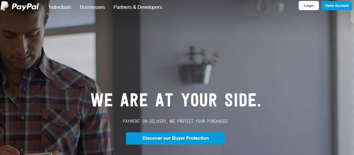
Take a look at PayPal.com. There are two clear CTA buttons. One at the top right-hand corner and one at the center of the page. They aren't obtrusive, annoying or flashy. Simplicity works best.
 

Final Thoughts
Webmasters and designers have to do everything in their power to make websites more welcoming. Anything can prompt a visitor to leave, such as slow speed times (or even too fast speed times) and annoying advertisements. The process of designing a website starts with the homepage. If you master the homepage then the rest of the creation will be simple and effective.
Comments will be moderated and
rel="nofollow"will be added to all links. You can wrap your coding with[code][/code]to make use of built-in syntax highlighter.