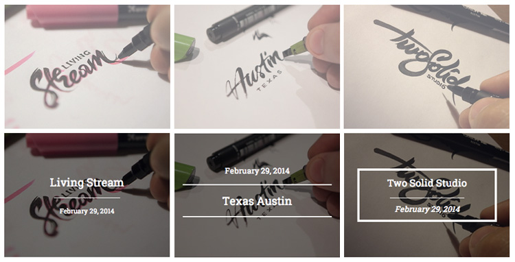
We started to see a lot of CSS3 animations around the web nowadays. Pure CSS3 animation such as flashing, fading, spinning, zooming, moving and a serial of complicated animations are emerging. What seems to be impossible to achieve with CSS only are now achievable fairly easily.
This is great news for people who aren't familiar with Javascript. You will able to create subtle animations easily with CSS3 transition and transform. It's supported by most modern browsers, for legacy browsers such as IE 8, we can use IE conditional tag to style it up in a way that it's usable.
Previously, I have introduced CSS transform and I also have a few tutorials with CSS 3D transform too. A quick introduction of CSS3 transition, take the following code as example. It's pretty straight forward, a link with 50% opacity, and on hover, the link will show in 100% opacity. What you will see here are simply toggle 2 states of opacities - 50% and 100%.
	a {
		opacity: 0.5;
	}

	a:hover {
		opacity: 1;
	}
What if you want it to fade from 50% to 100% or vice versa on mouse over? We can! With CSS3 transition. I added this transition: all 300ms ease-out; (you will need prefixes for different browsers) and what it does is - on hover, the opacity will fade from 50% to 100% and on hover out, it will fade back to 50%. Cool huh? Opacity is just one of the many CSS attributes, imagine what you can do with other.
	a {
		opacity: 0.5;
		transition: all 300ms ease-out;
	}

	a:hover {
		opacity: 1;
	}
This CSS3 tutorial will show you how to make simple and elegant hover effect for thumbnail image. Basically, it will show extra bit of information when you hover over the images. I have created 5 different styles - Single line, double lines, Top&Bottom, Zoom and Spin. All of them have very similar HTML markup, base CSS. The main differences would be how we style the info section.
We won't be going through each of them, but let me show you the double lines and zoom.

HTML
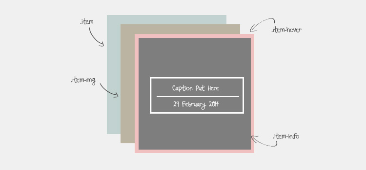
Here is the base structure of HTML. All the text content is wrapped inside of .item-hover class. We will be using .item-hover pseudo code :hover to trigger all the effects.
<div class="item">
		<a class="item-hover" href="{URL}" target="_blank">
		<div class="item-info">
			<div class="headline">
				Caption Put Here
				<div class="line"></div>
				<div class="date">February 29, 2014</div>
			</div>
		</div>
		<div class="mask"></div>
	</a>
	<div class="item-img"><img data-src="{IMAGE PATH}" alt="" /></div>
</div>
Here is the layers view of the HTML Markup.

CSS
One thing you'll notice is - all of the effects share the same base CSS code. The main different would be what within the .item-info. We style them to make it looks different, and add subtle animation accordingly. Here we have the code for zooming.
We will need to put all the browser prefixes for transition, transform and opacity.
.item {
	text-align:center;
	float:left;
	margin:5px;
	position:relative;
}

	.item,
	.item-hover,
	.item-hover .mask,
	.item-img,
	.item-info {
		width: 300px;
		height: 225px;
	}

	.item-hover,
	.item-hover .mask,
	.item-img {
		position:absolute;
		top:0;
		left:0;
	}

	.item-type-zoom .item-hover {
		z-index:5;
		-webkit-transition: all 300ms ease-out;
		-moz-transition: all 300ms ease-out;
		-o-transition: all 300ms ease-out;
		transition: all 300ms ease-out;
		opacity:0;
		cursor:pointer;
		display:block;
		text-decoration:none;
		text-align:center;
	}

		.item-type-zoom .item-info {
			z-index:10;
			color:#ffffff;
			display:table-cell;
			vertical-align:middle;
			position:relative;
			z-index:5;
	    -webkit-transform: scale(0,0);
	    -moz-transform: scale(0,0);
	    -ms-transform: scale(0,0);
	    transform: scale(0,0);
			-webkit-transition: all 300ms ease-out;
			-moz-transition: all 300ms ease-out;
			-o-transition: all 300ms ease-out;
			transition: all 300ms ease-out;
		}

		.item-type-zoom .item-info .headline {
			font-size:18px;
			width:75%;
			margin:0 auto;
			border:4px solid #ffffff;
			padding:10px;
		}

		.item-type-zoom .item-info .line {
			 height:1px;
			 width:60%;
			 margin:15px auto 10px auto;
			 background-color:#ffffff;

		}

		.item-type-zoom .item-info .date {
			font-size:14px;
			font-style:italic;
		}

		.item-type-zoom .item-hover .mask {
			background-color:#000;
			opacity:0.5;
			-ms-filter: "progid:DXImageTransform.Microsoft.Alpha(Opacity=50)";
			filter: alpha(opacity=50);

			z-index:0;
		}

		.item-type-zoom .item-hover:hover {
			opacity:1;
		}

		.item-type-zoom .item-hover:hover .item-info {
	    -webkit-transform: scale(1,1);
	    -moz-transform: scale(1,1);
	    -ms-transform: scale(1,1);
	    transform: scale(1,1);
		}

	.item-img {
		background-color:#7a548f;
		z-index:0;
	}
Conclusion
Depend on how you style it, you can also come out with a few more effects to suit your design. There are 5 effects here, you should view source of each of them and study it if you want to know how they work.
With just simple transition, you can create a great solution to display extra information hover on top of thumbnails. Have fun playing with it and modify/reuse it in whatever way you want. :)

Comments will be moderated and
rel="nofollow"will be added to all links. You can wrap your coding with[code][/code]to make use of built-in syntax highlighter.awesome.
you are a genius!!
Thanks for sharing!
Are we allowed to use these effects in a commercial project ?
Thanks for the amazing tutorial...
but there's a problem:
in the line 13 of css document you mentioned a width for every picture
which brings problem in terms of being responsive , and if you change it to 100% , the alignment of the text will not apply...
how can i solve it ?
I love these effects.
Thanks for sharing~ :)