A slider is pretty much one of the most popular web elements. One a website, with beautiful transitions and animations, caption and description and with the use of custom timings, an attractive business presentation delivered online.
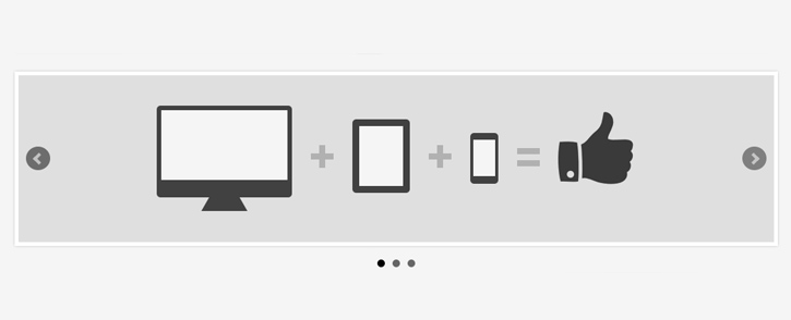
There are hundreds of slider plugins out there, although premium Javascript sliders usually provide more features, however, some free and well-maintained sliders do have outstanding features, vast configurations and well-documented. Nowadays, with the trendy responsive layout, sliders need to adapt to different screen dimension as well. Here we have 11 Free jQuery Sliders that supports responsive layout, not just that, most of them are featured packed too.
WOWSlider

WOW Slider is a responsive jQuery image slider with amazing visual effects (Rotate, Blur, Flip, Blast, Fly, Blinds, Squares, Slices, Basic, Fade, Ken Burns, Stack, Stack vertical and Basic linear) and tons of professionally made templates. WOW Slider is packed with a point-and-click wizard to create fantastic sliders in a matter of seconds without coding and image editing. Wordpress slider plugin and Joomla slider module are available also.
UnSlider

This slider focuses on simple and minimal. With less than 3kb, it has keyboard and responsive supports.
iView

iView is easy to use jQuery image slider with animated captions, responsive layout and HTML Elements like (Video, iFrame) slider. Easily add unlimited number of slides and captions. Use it as image slider, image gallery, banner rotator, banner ads, or even presentation.
ayaSlider
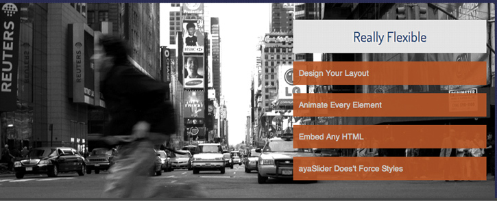
A flexible jQuery slider plugin that supports responsive, HTML element embedding and parallax animation.
Responsive Slides
ResponsiveSlides.js is a tiny jQuery plugin that creates a responsive slider using elements inside a container. It has been used on sites like Microsoft's Build 2012 and Gridset App. ResponsiveSLides.js works with wide range of browsers including all IE versions from IE6 and up. It also adds css max-width support for IE6 and other browsers that don't natively support it. Only dependency is jQuery (1.6 and up supported) and that all the images are same size.
Flexslider

One of the popular choices by developer. Flexslider is packed with many features. It supports touch swipe, callback API, custom navigation and different animations.
UnoSlider

UnoSlider is an advanced image and content slider which is built with responsive design and mobile devices in mind.
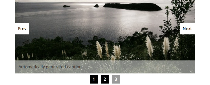
Camera

Originally called as Diapo slider. This is an improved version.
SlidesJS

SlidesJS is a responsive slideshow plug-in for jQuery (1.7.1+) with features like touch and CSS3 transitions. Give it a try above and check out the examples to help you get started adding SlidesJS to your project.
Basic Slider
Basic jQuery Slider has been developed to be as simple and lightweight as possible. Only the essential functionality has been included combined with clean semantic mark-up.
BXSlider
BXSlider is a fully responsive content slider. It supports rich content, touch/swipe, native hardawre acceleration and callback API.
Comments will be moderated and
rel="nofollow"will be added to all links. You can wrap your coding with[code][/code]to make use of built-in syntax highlighter.Responsive design is not just about scaling content to fit different screen sizes. It is about loading optimized content. Cell data plans are expensive and can be slow. We should not be loading large images and scale them down; we should be loading smaller images for smaller screens. Massive fail.
This is a complex issue, there are no "proper" ways to serve correctly sized image files from the server depending on screen size of the client. You can try displaying content images (which belong semantically in the HTML) instead as CSS background images nested in media queries, but there are a lot of cons to that hack (accessibility, not user-selectable, not easily managed in CMS, e.t.c.). A better approach, and probably the best solution at the moment (which also helps with handling Retina imagery) is http://adaptive-images.com .
Also remember, users resize browser windows all the time. If you serve small low-res images and they size the window back up images will look blury. The only way to counter that would be to attempt to sniff user agents, an approach that has many cons. There is no way possible for a server to know the type of internet connection (e.g. 3G vs ADSL) a client is using.
If you have a huge screen and a tiny browser window there is still a lot of potential waste if it never gets resized up. The assumption is often made that if you have a huge screen, you probably have a wired connection. However, this can be a flawed assumption in edge cases when desktop users are on a wireless dongle connection or they simply have a sucky wired service.
Ultimately there needs to be standards that allow us to serve images based on screen size, pixel density and the connection quality. There is a good take on this here: http://adaptive-images.com/details.htm#future
I also found this one very useful jquery slider and it’s totally free:
http://www.hislider.com