Sometimes less is more. And that is certainly true when it comes to branding. As a designer, one of the things you constantly strive for when you’re creating a logo is iconoclasm, a sense of instant recognition and timelessness. It’s that magic something that can help a logo endure and evolve across the years.
And as if that wasn’t hard enough, you have to also consider how the logo will look when it appears on all kinds of different media.
Press, outdoor and six-sheet advertising will all do different things to your logo and test its effectiveness to the max. Those challenges are nothing new and building branding that works whether its one-inch or several feet tall is something that designers have become accustomed to dealing with. And then along came digital. Now designers don’t just need to consider how their logos will look on screen, there’s now a whole catalogue of screen types and dimensions to consider.
Laptops, desk tops, smart phones, androids, tablets; there are a lot of devices out there. What this variety calls for is a new web design approach that crafts sites and web elements to provide an optimal user experience - easy to read, recognise and navigate - with the minimal amount of screen re-sizing, panning and scrolling.
The solution lies in the use of responsive design. There’s a lot of buzz about responsive design at the moment, and rightly so. Considering the popularity of mobile web browsing it’s crucial that every website is capable of responding to every user’s screen size requirements.
Here are some fresh examples of minimalist logo designs that comply to the principles of responsive design. They all illustrate exactly how you can work with the limitations of small-screen and the demands they place on the logo.

Nothing could be more simple than an initial-based logo. The shadow and mix of lower and upper cases keeps interest and adds a strong sense of style.

Regardless of the size it appears or the media it takes, monochrome is the boldest choice for a logo and often the most striking.

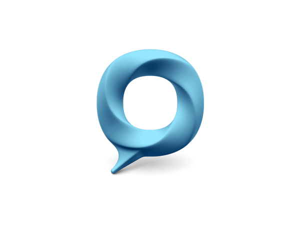
Another monochromatic treatment, this time with a turquoise background. The white graphic looks super-clean and the detail where the two circles cross show how effective simplicity can be.

These vertical lines will look impressive and will not distort - no matter how much your screen resizes them.

Iconic branding can still be delicate, as this example clearly shows.

A logo such as this is simple and subtle enough to work on a variety of backgrounds.

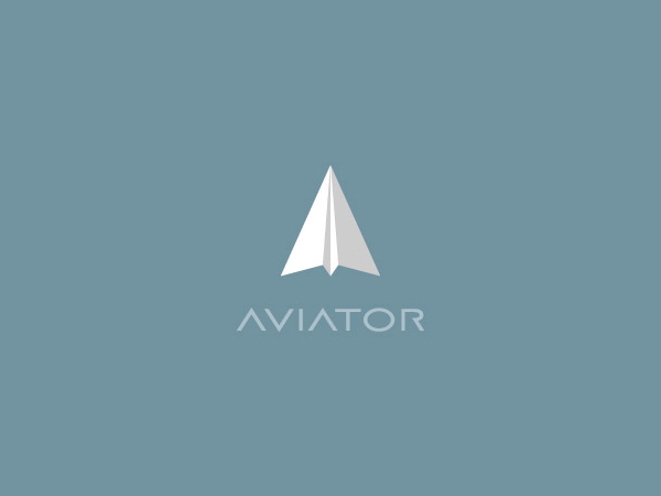
The gorgeous colours in this design have been layered to add a sense of depth and perspective.
When your user is viewing on a small screen it’s crucial that your type is clear and easy to read. This typeface is super simplistic and understated, yet perfectly legible.

This brilliant logo takes the humble ampersand and turns it into an unforgettable brand thanks to some bold colour choices and depth-enhancing shadows.
A simple design is given added interest through texture and and unusual colour choice.

A celtic-inspired logo that is easy to visualise working both on outdoor advertising and on an android.

Animal-based logos are a popular choice for adding personality to a brand, and this colour-block treatment won’t distort whatever size you view it at.

To prevent this logo from falling flat, the designer has hit on the brilliant idea of showing us what lies beneath it; a clever trick to add more interest to a simple treatment.

Similarly, this graphic creates a sense of continuing beyond the screen through the smart use of a monochrome colour palette.

This logo is hard to ignore with it’s bold colour palette and other-worldly glow.

Subtle and strong, with the potential to remain eye-catching when viewed on a palm-top device.

Surprising design doesn’t have to shout. With the ever-so-slight jaunty angle of the centre square, this design shows a huge amount of personality.
Comments will be moderated and
rel="nofollow"will be added to all links. You can wrap your coding with[code][/code]to make use of built-in syntax highlighter.