Today we are going to show you how to mask images with shapes plus some nifty zoom animation effects with just HTML & CSS. I have seen this kind of styling and effect in many portfolio websites and let me show you how it's made.
Personally, I don't think we should withhold ourself from using new technology or technique such as CSS3 on web projects because of old browsers don't support them. I believe we should "reward" users with modern browser by giving them a better user experiences. Therefore, I enjoy using CSS3 in my projects, but of course, we have to make sure it can degrades gracefully or at least display well in old browsers.
This tutorial will be using CSS3 transform which means, old browsers will not show the zooming effect. Good news is, I have coded it, even if it's old browsers, it will still look pretty good and usable. If you want something hardcore, you can check out my previous tutorial - Create Beautiful Hexagon Shape With Pure CSS3.

Here are some of the websites that are using the similar way in theirs portfolio page:

Â
IMAGES
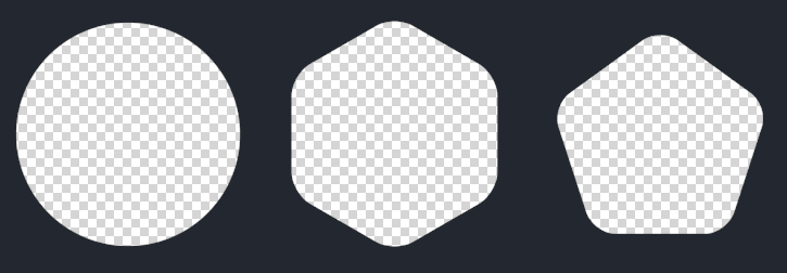
We want this example to be usable in most browsers, therefore, we're not going to draw the shape using CSS3 or whatever fancy techniques. We stick to the ancient way - transparent PNG. This is how each of the shape looks like:

HTML
To make it easy to understand, I have made an image to illustrate what each layer does.

<div class="shape">
	<a href="{URL}" class="overlay {round|hexagon|pentagon}"></a>
	<div class="details">
		<span class="heading">{TITLE}</span>
		<hr />
		<p>{DESCRIPTION}</p>
		<a href="{URL}" class="button">VIEW</a>
	</div>
	<div class="bg"></div>
	<div class="base">
		<img data-src="{IMAGE URL}" alt="" />
	</div>
</div>
In case you need the fonts I used in this tutorial, here is it:
<link href='http://fonts.googleapis.com/css?family=Abel' rel='stylesheet' type='text/css'>
<link href='http://fonts.googleapis.com/css?family=Roboto+Slab' rel='stylesheet' type='text/css'>
<link href='http://fonts.googleapis.com/css?family=Roboto+Condensed:400,700' rel='stylesheet' type='text/css'>
Â
CSS
We don't have Javascript in this tutorial. We use :hover pseudo code and also CSS animation to do simple mouseover and zooming effects.
Here is the portion of code that does all these animation effects:
......

.shape .overlay {
	display:block;
	width: 310px;
	height: 310px;
	position: absolute;
	top:-5px;
	left:-5px;
	-webkit-transform: scale(1,1);
	-webkit-transition-timing-function: ease-out;
	-webkit-transition-duration: 0.6s;
	-moz-transform: scale(1,1);
	-moz-transition-timing-function: ease-out;
	-moz-transition-duration: 0.6s;
	transform: scale(1,1);
	transition-timing-function: ease-out;
	transition-duration: 0.6s;
	z-index:500;
	/* allow user to actually perform actions underneath this layer */
	pointer-events:none;
	background-repeat: no-repeat;
}

......

/* hover effect */
.shape:hover .overlay {
	-webkit-transform: scale(1.07,1.07);
	-webkit-transition-timing-function: ease-out;
	-webkit-transition-duration: 0.3s;
	-moz-transform: scale(1.07,1.07);
	-moz-transition-timing-function: ease-out;
	-moz-transition-duration: 0.3s;
}

.shape:hover .bg {
  -ms-filter: "progid:DXImageTransform.Microsoft.Alpha(Opacity=80)";
  filter: alpha(opacity=80);
  -moz-opacity: 0.8;
  -khtml-opacity: 0.8;
  opacity: 0.8;
  display:block;
}

.shape:hover .details {
  -ms-filter: "progid:DXImageTransform.Microsoft.Alpha(Opacity=100)";
  filter: alpha(opacity=100);
  -moz-opacity: 1;
  -khtml-opacity: 1;
  opacity: 1;
	z-index:450;
  display:block;
}

......
Here is the full CSS:
.shape {
	width: 300px;
	height: 300px;
	position: relative;
}

	.shape .overlay {
		display:block;
		width: 310px;
		height: 310px;
		position: absolute;
		top:-5px;
		left:-5px;
		-webkit-transform: scale(1,1);
		-webkit-transition-timing-function: ease-out;
		-webkit-transition-duration: 0.6s;
		-moz-transform: scale(1,1);
		-moz-transition-timing-function: ease-out;
		-moz-transition-duration: 0.6s;
		transform: scale(1,1);
		transition-timing-function: ease-out;
		transition-duration: 0.6s;
		z-index:500;
		/* allow user to actually perform actions underneath this layer */
		pointer-events:none;
		background-repeat: no-repeat;
	}

/* different shapes */
.shape .overlay.round {
	background: url(round.png);
}

.shape .overlay.hexagon {
	background: url(hexagon.png);
}

.shape .overlay.pentagon {
	background: url(pentagon.png);
}

/* hover effect */
.shape:hover .overlay {
	-webkit-transform: scale(1.07,1.07);
	-webkit-transition-timing-function: ease-out;
	-webkit-transition-duration: 0.3s;
	-moz-transform: scale(1.07,1.07);
	-moz-transition-timing-function: ease-out;
	-moz-transition-duration: 0.3s;
}


.shape:hover .bg {
  -ms-filter: "progid:DXImageTransform.Microsoft.Alpha(Opacity=80)";
  filter: alpha(opacity=80);
  -moz-opacity: 0.8;
  -khtml-opacity: 0.8;
  opacity: 0.8;
  display:block;
}

.shape:hover .details {
  -ms-filter: "progid:DXImageTransform.Microsoft.Alpha(Opacity=100)";
  filter: alpha(opacity=100);
  -moz-opacity: 1;
  -khtml-opacity: 1;
  opacity: 1;
	z-index:450;
  display:block;
}


/* content styles */
.shape .bg,
.shape .details {
	position: absolute;
	width: 300px;
	height:300px;
	display:table-cell;
	vertical-align:middle;
	text-align:center;
	top:0;
	left:0;
	opacity:0;
	-webkit-transition: all 0.3s ease;
  -moz-transition: all 0.3s ease;
  -o-transition: all 0.3s ease;
  transition: all 0.3s ease;
	display:none;
}

.shape .bg {
	background: #4b5a78;
}

.shape .details span.heading {
	font-family: 'Roboto Condensed', serif;
	font-size:30px;
	display:block;
	margin-top:70px;
	color:#fff;
	text-decoration:none;
}

.shape .details p {
	font-family: 'Abel', sans-serif;
	color:#fff;
	width: 70%;
	font-size:14px;
	margin:0 auto;
}

.shape a.button {
	padding:5px 15px;
	font-family: 'Abel', sans-serif;
	font-size:12px;
	-webkit-border-radius: 20px;
	-moz-border-radius: 20px;
	-ms-border-radius: 20px;
	-o-border-radius: 20px;
	border-radius: 20px;
	background: #2f3644;
	text-decoration:none;
	color:#fff;
	display:block;
	width:50px;
	margin:0 auto;
	text-align:center;
	margin-top:15px;
}

	.shape a.button:hover {
		background: #fff;
		color: #2f3644;
	}
Â
Conclusion
That's it, pretty simple to make and look elegant too. You can change the shape to whatever you want. This tutorial is tested on IE8 and should work in most modern browsers. If you have any questions, drop a comment.

Comments will be moderated and
rel="nofollow"will be added to all links. You can wrap your coding with[code][/code]to make use of built-in syntax highlighter.http://codepen.io/the-mo/pen/ycwuf