In this tutorial, we are going to make hexagon shapes that support HTML content and also background image with just CSS3. CSS3 has been an amazing revision in creating more advanced styling. Don't believe me? Check this awesome graphic coded purely with CSS.
With CSS Transform, we can easily skew, rotate and other manipulations on DOM element. We are going to use CSS3 rotate and masking to achieve what we want. This tutorial will be slightly complicated in CSS part, and I have tried my best to explain it with illustrations. Alright, let's get started.
HTML
This hexagon can have two different styles. You can either put text content in it or just pure image. The HTML markup is quite similar and they also share the same CSS.
Referring to the HTML markup below, there are two div called .corner-1 and corner-2, we will rotate these two divs to 60 degree to create the shape we want.
<div class="hex hex-3">
	<div class="inner">
			<h4>CONTACT US</h4>
			<hr />
			<p>We Open Everyday</p>
	</div>
	<a href="#"></a>
	<div class="corner-1"></div>
	<div class="corner-2"></div>
</div>

<div class="hex" style="background-image: url(images/2.jpg);">
	<a href="#"></a>
	<div class="corner-1"></div>
	<div class="corner-2"></div>
</div>
CSS
Alright, it will be a little bit complicated in CSS section. A hexagon has six edges and each angle is 60 degree. We are going to build a hexagon with 3 rectangles. Referring to the picture below, in step 1 to 3, we are placing 2 rectangles on top of the main one and rotate them 60 degree. That's how a hexagon is made.
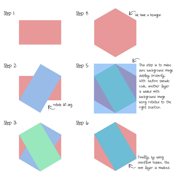
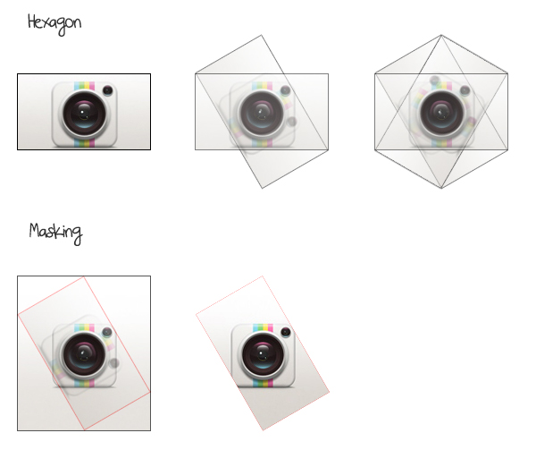
For the background image, there is more work to make it display correctly. Because we have rotated both corners, the background image is rotated as well. Therefore, to rectify this, we will be using :before to duplicate its content, rotate it back, make it a square, and mask it with overflow:hidden.
Here I have another illustration to let you see it a little bit more clearly.
.hex {
	width:150px;
	height:86px;
	background-color: #ccc;
	background-repeat: no-repeat;
	background-position: 50% 50%;
	background-size: auto 173px;
	position: relative;
	float:left;
	margin:25px 5px;
	text-align:center;
	zoom:1;
}

	.hex.hex-gap {
		margin-left: 86px;
	}

	.hex a {
		display:block;
		width: 100%;
		height:100%;
		text-indent:-9999em;
		position:absolute;
		top:0;
		left:0;
	}

	.hex .corner-1,
	.hex .corner-2 {
		position: absolute;
		top:0;
		left:0;
		width:100%;
		height:100%;
		background: inherit;
		z-index:-2;
		overflow:hidden;
		backface-visibility: hidden;
	}

	.hex .corner-1 {
		z-index:-1;
		transform: rotate(60deg);
	}

	.hex .corner-2 {
		transform: rotate(-60deg);
	}

	.hex .corner-1:before,
	.hex .corner-2:before {
		width: 173px;
		height:	173px;
	  content: '';
	  position: absolute;
	  background: inherit;
	  top:0;
	  left: 0;
	  z-index: 1;
	  background: inherit;
	  background-repeat:no-repeat;
		backface-visibility: hidden;
	}


	.hex .corner-1:before {
		transform: rotate(-60deg) translate(-87px, 0px);
	  transform-origin: 0 0;
	}

	.hex .corner-2:before {
		transform: rotate(60deg) translate(-48px, -11px);
		bottom:0;
	}


	/* Custom styles*/
	.hex .inner {
		color:#eee;
	}

	.hex h4 {
		font-family: 'Josefin Sans', sans-serif;
		margin:0;
	}

	.hex hr {
		border:0;
		border-top:1px solid #eee;
		width:60%;
		margin:15px auto;
	}

	.hex p {
		font-size:16px;
		font-family: 'Kotta One', serif;
		width:80%;
		margin:0 auto;
	}

	.hex.hex-1 {
		background: #74cddb;
	}

	.hex.hex-2 {
		background: #f5c53c;
	}

	.hex.hex-3 {
		background: #80b971;
	}
Conclusion
This hexagon shape tutorial is pretty straight forward. It took me a while to figure it out and along the process of experiementing, I did pick up a few tricks such as CSS transform and masking. I hope you enjoy this, if you have any questions, drop us a comment. If you liked this, please share it via social media. Thanks :)
Comments will be moderated and
rel="nofollow"will be added to all links. You can wrap your coding with[code][/code]to make use of built-in syntax highlighter.Can this work inside a CMS like Joomla?
Thank you!
I'll be doing this right now, let me know if your interested and i'll pass over the code once completed, of course it might be easier to let me know what you're trying to achieve so i can apply the details, i'll need to ensure its responsive too of course.
But one thing I didn't really get is how should I calculate if I want to scale up the hexagon.
In the example your building the hexagon with the width of 173 px.
I can see the pattern in .hex-1:before when the translate is half the value but can't see the pattern when I'm looking at .hex-2:before and also I find hard to figure it out how the get right values i width and height on .hex as a pattern.
Hope you understand what I mean. For example I want to build hexagons with the size of 260 px. How should I calculate to get it right?
I think 173px is calculated like this.
First :
if you want to scale up the hexagon 260px.
Width of ".hex" => 260px
Height of ".hex" => 260*tan(30°)=150
Next:
then. 173px is height of hexagon.
So.you can calculate it from two times the height.
=>150px *2 = 300px
This is the hexagon height when you scale up to 260px.
For those that are attempting to create different sized hexagons, you will need to use values that are common denominators of the existing width and height values to maintain the ratios, otherwise you end up with fractions that don't work.
I have coded a COMPASS/SCSS version of your code, including hexagon scaling feature.
Code is available at: http://codepen.io/interdruper/details/GrBEk
Works great too!
One Q: How to fill hole hexegon with photo correctly without space around it? Now I have to leave some free space around my centered images in hexagon.