How do you convince people to drop whatever they’re doing for a vacation? In today’s busy world, booking a vacation seems like an impossible dream. It is difficult for people to just jump in without worrying about what they will leave behind. Others would think twice about spending their hard-earned money. For a startup travel business, this should be the number one challenge they should overcome.
There are a lot of gimmicks and strategies that you can try, but having your own website is a must. Let’s just say that a website will be your face to the entire world. Without one, you have already lost the trust of your potential customers.
The secret to successfully winning the hearts of your visitors will be a winning travel website design. Fireart.studio offers a great resource to help you start designing your own web design, but of course, most of the ideas should be yours. This is for the sake of setting the right mood and introducing your brand’s uniqueness.
Not sure on how to get started? You can check out the following travel websites for inspiration: Â
Astoria Villa
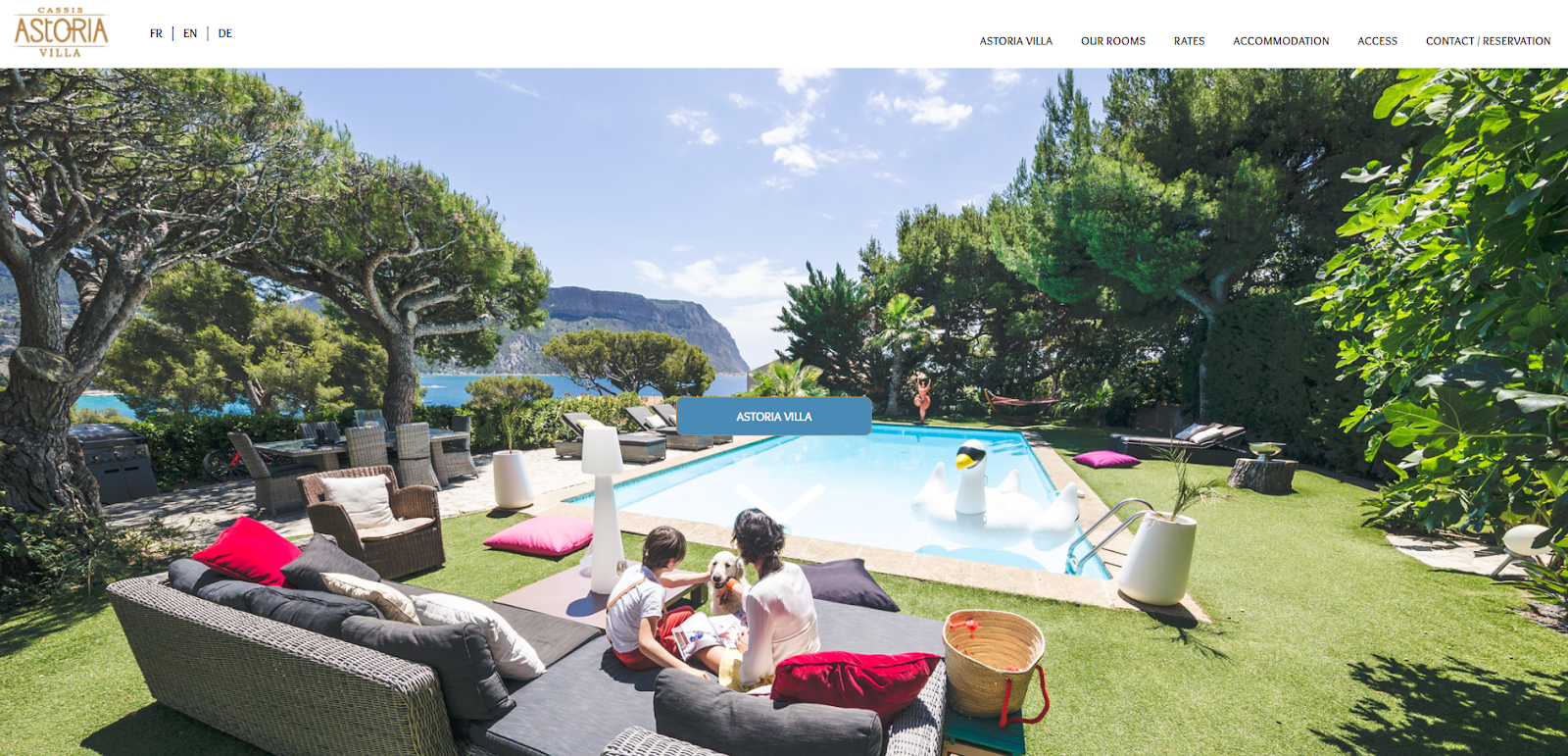
Gorgeous high-definition pictures will welcome the visitors of Astoria Villa’s website. Their photographs captured everything that would attract people to their location. White and light brown are the primary colors selected to complement the pictures. It helps give emphasis to the view and mood the website is trying to convey.
In addition, the color combination gives off a professional and clean look. This will give the impression that your services can be trusted. Their website also features a responsive design, making viewing easier for people using multiple devices.
Costa Navarino
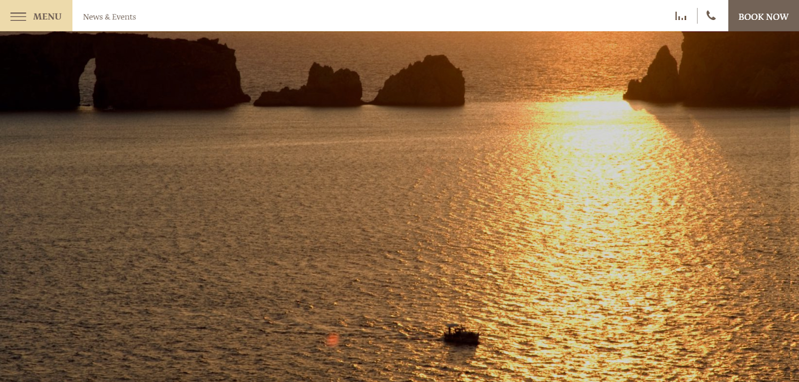
Using vivid and breathtaking photographs is a great way to build a desire for a vacation. Adding sounds will create a need to immediately book a trip. A combination of both can already help you get started on packing your bags.
This was the strategy used by the developers of Costa Navarino website design. As you scroll through their homepage, gentle animations will play with your eyes. Everything is accompanied by the sound of the breeze and the waves. Relaxing, isn’t it?
Navigation is also easy and visible. Right at the top of the website, you already have the option to call and make a reservation. Also, the current weather situation is displayed to give you an update.
Residence Hotel Paradiso
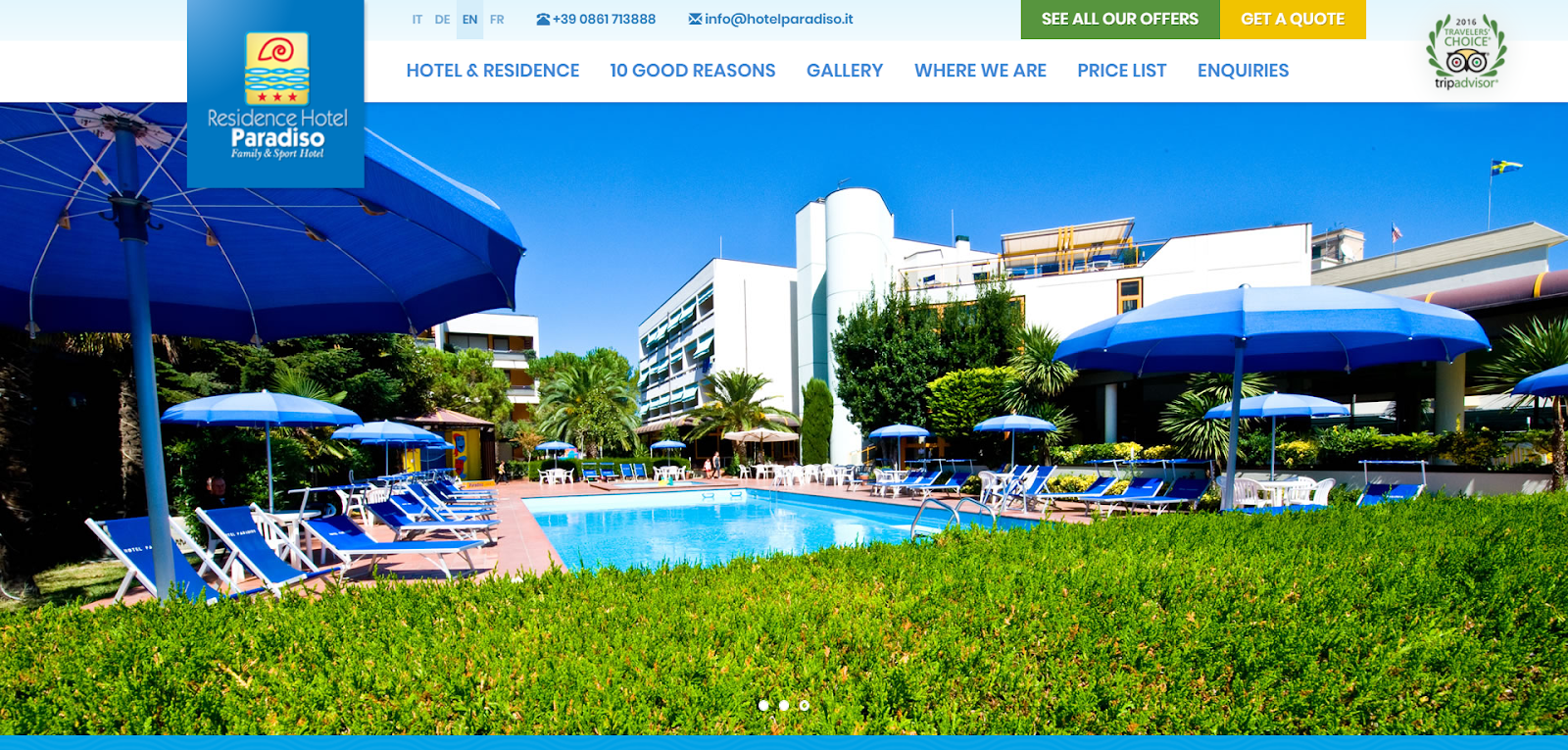
What their travel website designers did great was the choice of color. It is important to make an impression of who you are just from the website alone. In this case, their use of Blue gives off feelings of relaxation and calmness. It was accompanied by the color White, which can give the idea that they offer professional services.
Since the color Blue plays a significant role in their website, they also made sure to highlight its presence in their waters. They made that possible by welcoming visitors with
high-definition photographs of their amenities and pools. With the colors popping out from the screen, it will make you feel like as if you were there.
Aside from capturing the visitors' interest, they also made sure that the website remains easy to use and navigate. Their contact information is visible, along with their special offerings
and promos that you might need to know. Â
Travel Oregon
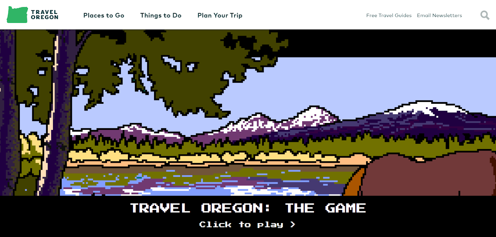
What’s the best way to a travel agency website design standing out from the rest? Having a custom design and utilizing new tools might just work, and Travel Oregon proves it. Instead of featuring gorgeous images to catch their visitors’ attention, they chose to be interactive. You can actually play mini-games that will give you an idea of how fun your trip will be. Â
Despite being innovative, they didn’t forget to stick to the basics. Their interface remains clean, simple, and easy to use. Topics you would be curious about, such as places to go, things to do, and travel guides are visible and easily accessible. The elements just a healthy combination of new and old, which resulted in this amazing website.
Rakso Travel
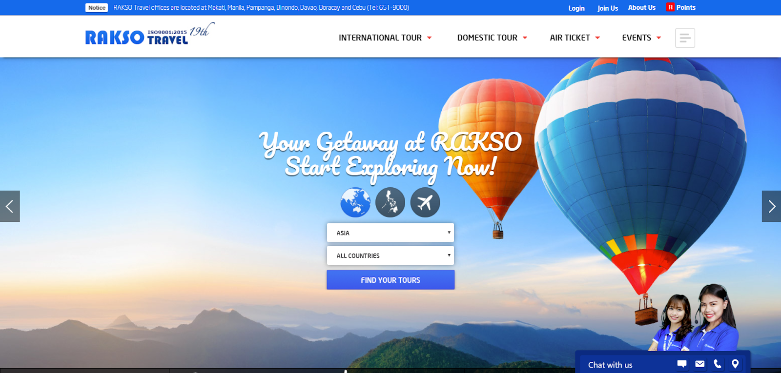
Their travel agent website design was aiming for a more professional look. This was achieved by utilizing the colors properly, choosing the right font styles, and a slideshow of pictures featuring their services. Because of this, travelers will feel more secure and safe to trust you to their next travel destination.
Also, the developers considered today’s trends, such as Parallax Scrolling when designing this website. This makes the website appear fresh, updated, and active.
Turneffe Resort

Turneffe Resort’s page has everything a trendy site would have, and that makes them a solid candidate for the best travel website design. They utilize video banners, light colors, and bold texts. The end result is a beautiful page that resembles a video blog of unforgettable moments in their resort.
Navigation was also easy to find and utilize. The same goes for the important information you might need to know, such as their contact number, flight times, and the current situation in the island.
The Estate Trentham
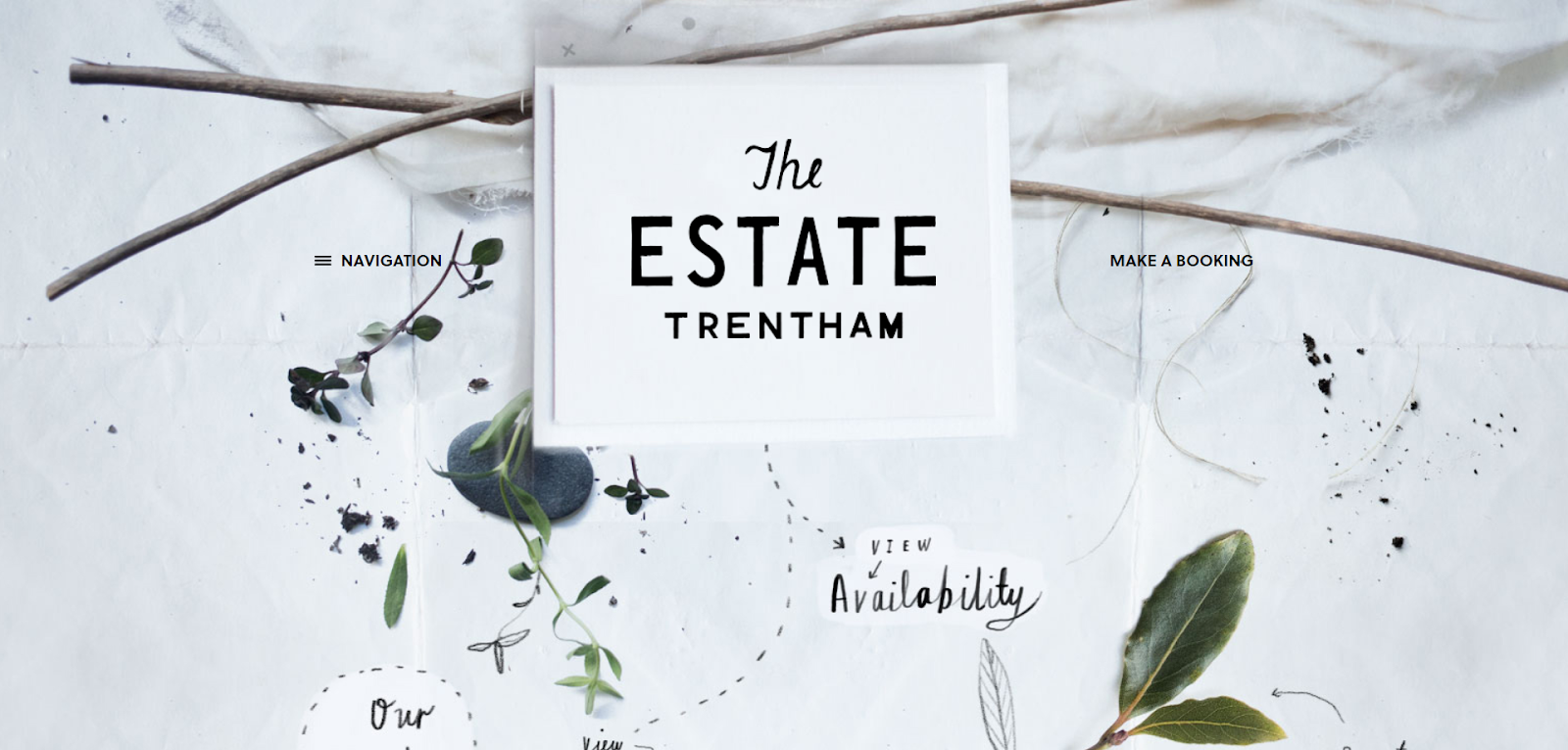
We already discussed a website that has a resemblance to a video blog. Now, it is time for us to explore this website that was arranged like a scrapbook.
Most websites would utilize the common layouts, but the developers dared to try a whole new approach to their work. It is as if the website is a handmade scrapbook that visitors can interact with. Almost everything looks handwritten, with the textures appearing to be realistic. This is a good way to attract customers seeking a more homey, quiet, and natural environment. Its unique yet easy navigation is something to keep in mind when planning your own brand, too.
Conclusion
To sum everything up, here’s a list of the tips to make your website design planning a success:
-
Color Psychology plays a vital role. Make sure that your color choice will properly express your brand’s identity.
-
Keep navigation simple. It is crucial to have a sitemap that is easy to understand and use.
-
Make sure the important information are visible. These include your business’ address, contact number, email address, and the price of your services (optional).
Don’t forget to follow a responsive web design and do not be afraid to try something new!
Comments will be moderated and
rel="nofollow"will be added to all links. You can wrap your coding with[code][/code]to make use of built-in syntax highlighter.