A call to action, or CTA, is a prompt on your website which gets your visitors to do something, to complete an action. It can be anything, something simple like clicking a link to another page or clicking a button to download a PDF, sign up for a newsletter or sign up for an event. You’ve seen them everywhere and I’m sure you’ve click on a bunch of them too.
So, what are CTAs all about? What things should you consider when making them? You’re about to find out.
Bedazzling your call to actions
It’s not enough for you to just add a button to a page that says ‘Click me!’ That won’t get you anything. But, you can do a few things to the CTA. First and foremost they need to be eye catching. Any and all CTAs will have to strike a balance between blending into the remaining content and overpowering the page. It can’t be over the top bedazzled - I’m sorry to break this to you but this won’t help you at all. However, they do need to stand out from your content. This can be done through size, colour, surrounding whitespace and position of the CTA.
Size
Most CTAs are buttons so it’s easy to say that these buttons need to be big enough to be seen. I’m going to assume you have common sense not to make it gigantic, disproportionate and just over the top - unless that’s what you are after. However, make sure that the button is slightly bigger.
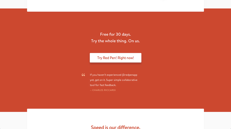
As you can see Red Pen’s website has a big white button in the middle of this short text. The button itself is much bigger compared to the text. There I no doubt about it, you are being called to click on it!
The ‘I want one’ button is enormous! It draws your attention in like crazy, doesn’t it?

Colour
Another way to make your CTA to stand out is through colour. I wouldn’t suggest adding a new colour to your pallet just to give your CTA a unique hue; consider your scholar scheme as it is. If you have a very specific colour scheme, keep the bright and highlighting colors for your CTA and keep them to minimum to the rest of the content or page so that the CTA can actually stand out. The more contract the CTA has over the page the more attention it will get. You might want to subdue the colour the bigger the button or the more white space there is around it. Like I said, it’s all about striking a balance.
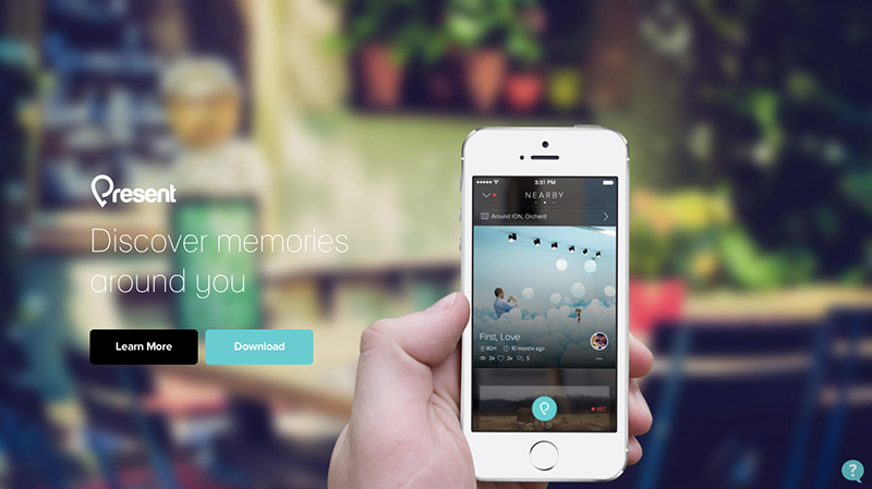
Here we have two buttons, to learn more and to download the app. But the main CTA, the one to download the app is brighter and it’s the first one you notice. It’s the one you pay attention to.
This website has a few different colours in its colour scheme and it’s uses the green hue for all its CTAs. It’s brilliant as the green stand out well.

Whitespace
Whitespace has been a very important design element over the last few years and it’s also portent for CTAs. If you have a sing up button, you want there to be whitespace around it to draw attention to it. You don’t have to isolate your CTAs at all cost form the remaining of the content but a good amount of whitespace could be the key in giving the CTA enough attention.
There is absolutely nothing around this download CTA. There is some padding around it but there is no text which makes the button the only item you could pay attention within the section.

The ‘buy now’ button atop is in a corner of the page but, is anything but tucked away. It is right next to the navigation nor is it right by the edge of the browser window. It stand out just fine thanks to it’s surrounding whitespace.

Position
There is no golden rule about how many CTAs there should be per page, or per section. It’s most common to see a CTA of the introductory of first section of a page. It’s quiet important to have the CTA above the fold and in the beginning of the page. However, if your page is longer it’s also common to a CTA (usually the same CTA as atop) at the very bottom. It speaks to the story telling of the page and its flow where you start and end with the same point. After all, you want your visitors to take an action; if they have scrolled all the way down you should tell them what to do next. No?
This page’s CTA is one and the same as you scroll down the page. It’s in the same exact spot – top right - because it has a fixed position. It’s ways there to nag you to click!

Gumbo has the exact same CTA in its intro section as it does at the very bottom of the page. It’s not the longest of pages but I’m sure it helps to have the two CTAs.

Language of the CTA
Besides the way your CTA looks, it is also important to figure out what the CTA should say. I can tell you right of the bat that saying something vague like ‘Click here!’ won’t work and your conversion rate will be terrible. Make sure your CTA’s copy make sense in content to your page. You are aiming to have clear and simple copy - keep it detailed but above all make sure it contain an action. People are compelled by verbs and action versus statements. What’s more limey to get you to click a button ‘ Our awesome webinar’ or ‘Sign up for our quick webinar’. The second is a little longer, but it tells the visitor to do something - to sign up - and it also shows off that the webinar is quick. This gets rid of the hesitation and will probably get much higher conversion than the first copy.
In order tog et more people to sign up Tree House specifically states that you can start a free trail with them right then and there. Including the word free I’m sure helps their conversions a bunch.

I love, love, love the copy on the CTA, it’s personal and personable. It’s not a typical ‘ show now’ or ‘see products.’ It’s a very friendly message., and it’s more powerful because of it.

Keep on testing
I think the most important thing about CTA is that they should ways be tested. Call to actions are meant to convert and even if your conversions are great, they can always be better. Don’t do anything crazy but try simple test instead, first try different copy than try a different colour. Small but subtle changes will give you better results than drastic changes. One small thing at a time and you’ll have killer call to actions!
Comments will be moderated and
rel="nofollow"will be added to all links. You can wrap your coding with[code][/code]to make use of built-in syntax highlighter.