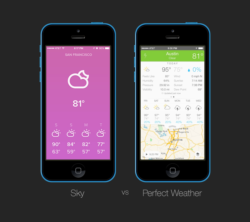
Often time you see designers and articles preaching for simplicity. It’s a very common topic when one talk about mobile design especially because of the smaller screen sizes. However, it is in fact true that simplicity is scientifically better for designs. Simple designs are easier to comprehend and it makes them more aesthetic.
There are many serious advantages to consider when developing a less visually complex design – a simpler design - versus a more visually complex one. If you don’t believe me checkout some of these studies preformed by Harvard, University of Maryland and University of Colorado and well as Google.
1. Low complexity is easier to process.
Low complexity designs don’t require as much physical strain as more complex ones. The more complex a design, the more energy, effort and time it takes the eyes and the brain to process what is being seen. You’d want to have the least amount of variations within your app design such as limiting your colours, copy, graphics or fonts; in turn, this will create for a less complex design. Humans are lazy creatures so the easier something is the better we like it.

When it comes to mobile design you don’t want your app to have to many things going on, as it will turn people off. Mobile devices have smaller screens then a typical computer therefore we need to optimize our interfaces and designs. The worst thing we can do when optimizing the interface is strip away the design in order to cramp in more content. Content is part of visual complexity and it too needs to be cut down the minimum on mobile devices as well. The most simplistic of designs will be the easiest to digest meaning it will appeal the most to users and visitors.
2. Low visual complexity is more aesthetically pleasing.
Visual complexity also effects how aesthetic the design is perceived to be. If you assume that the less visually complicated a design is the more aesthetic is seem, you’d be right. This goes along the premises that the lesser complexity is simpler to process. When the design is simple, the design is often times perceived as more aesthetic compared to more visually complex designs. Lower visual appeal comes from more visually complex designs; and that is by far not something anyone wants.
“Simplicity breeds elegance, and engages the reader at a deep, aesthetic level.â€

It’s easy to say that less is more, as less visually complex mobile designs will appear to be more aesthetically pleasing to users. So, it’s easy to say that not only are simpler designers easier to handle, they are better looking too. Cutting down on visual variations like fonts, colours or graphics can significantly improve the visual appeal of a mobile design. Keeping things simple is a tremendous advantage that you should be embracing in order to aesthetically appeal to more users or visitors.

3. Cognitive fluency is important.
People prefer to think about things that are easier to think about; that’s cognitive fluency. Cognitive fluency refers to how easy or difficult the subjective experience of a mental task is to preform. It’s not the mental process itself but the feeling that goes along with it; it’s the perception that something is easy or difficult. It’s important for users to be in familiar surroundings or settings so that things are easier for them. Familiarity means that there is less mental strain therefore it can be a strong motivator for human behavior.
“… The feeling of familiarity has a strong influence over what types of things people find attractiveâ€
When creating a mobile app, or website, experience keeping things familiar is always good. This means that when a user visits w responsive website of an elegant restaurant, he expects it to look elegant through the use of colours, typography and whatever else design elements that will help the design look like a fancy restaurant’s website. When the design is not up to those standards the cognitive fluency is perceived to be difficult which is a bad thing.

4. Mental models, FTW.
Mental models is similar to cognitive fluency where we have expectations of things to look a certain way. We all have a mental model of a tree or a car. The same can be applied to websites as ecommerce websites are structured the same way and so are blogs and so on. If the mental model is problem and an ecommerce website looks more like a blog people will get confused. Worse, people will not enjoy the experiences much because it’s not what they expected it to be.
“Keep it simple, stupidâ€
When it comes to mobile designs the same holds true. Don’t create apps with complicated and new menus or navigations. You want people to use your apps or responsive websites with as much ease as possible. Keep current mobile design conventions at hand in order to provide a simple and well know mental models for your visitors to follow easily.
5. Be aware but also be creative.
With the above four restrictions mentioned it can be scary to design something out of the norm. I don’t think it’s the healthiest of ideas to create out of the blue design solutions because the above points are in fact valid. But there is a caveat, just because you should keep simplicity and mental models in mind doesn’t mean you can’t be creative.

It’s okay to create visually interesting and more complex mobile designs if they help you solve your design problems. It’s okay to break current conventions in order to provide a better experience. The point of this article is not to stop on your creativity; the point of this article is to make you aware of how to design better by letting you know that simplicity and design is a good things.
Now, go great something great!

Comments will be moderated and
rel="nofollow"will be added to all links. You can wrap your coding with[code][/code]to make use of built-in syntax highlighter.