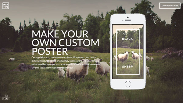
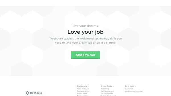
Just like any other web page, landing pages too have an introductory section, a header. The current design trends and conventions usually use an image - either of the product like an iPhone app, or some cool full width background that somehow relates.
I think it makes sense, images are powerful. Pictures are perfect in showing off your product; duh. This makes for an instant connection, the viewer gets an instant impression of what’s being talked about here. We also see big and beautiful background images. Photographs capture emotions and moments; that’s something we love as humans. We love to connect.
A pretty picture
There is more in a header section than just a pretty picture. Most often then not there will be a clear heading explaining what the page is all about. Headings are crucial as they are the first greeting from the page. Think of the heading as the actual first introduction and as another way to grab your visitor’s attention; it’s a chance for you to entice them, so take it! Some headers go even a bit further to have a short description, albeit it a quick summary, of the product.
Calling to an action
The one thing that every landing page should have, front and center, is a call to action at the very beginning of the page. After all, landing pages are meant to get people to be interested and convert. You can’t do that if you don’t have a call to action. These calls serve a very specific and great purpose, they tell people what to do. People ned to be guided, if you just present your product, that won’t be good enough. You need to tell your visitors what you want them to do otherwise they won’t do anything, they will leave and you’ll be left empty handed.


Keeping it short versus long
Some landing pages keep it very simple where all they have is a header. They have a straightforward introduction and that’s it. On the other hand there are landing pages that just go on and on! Neither form is bad unless it doesn’t help solve your specific problems. If you were going with the short version, you’d be done by now. But for those who don’t want to leave it off just yet there is more that you can do. Most long landing pages are long because they elaborate on the product - what is it, how does it work and what it can do for you. There are a few other sections that you could find. Let’s talk about them now.

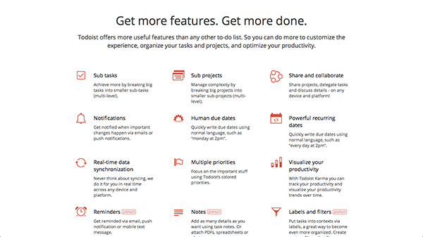
Boosting about your product
Either you call it the features section or whatever else, at the end of the day you are trying to highlight your product. So what kind of things can you expect to find here? Actually there could be so many, none are truly mutually exclusive you could have both benefits and features. It’s up to you.


This section is the meat and patties of the page where you will be highlighting a verity of things. Most obviously you can highlight a few key features. Don’t list every single thing your product can do. It won’t help anyone. Instead, pick 3 or 4 amazing things and talk about them. The same goes for benefits or value proposition. Benefits differ from features as features describe what your product can do a, i.e you can view pictures on your Mac. Benefits on the other hand talk about the problem that it is helping you with or what it could do for you, i.e you can capture memories with Photo Booth.
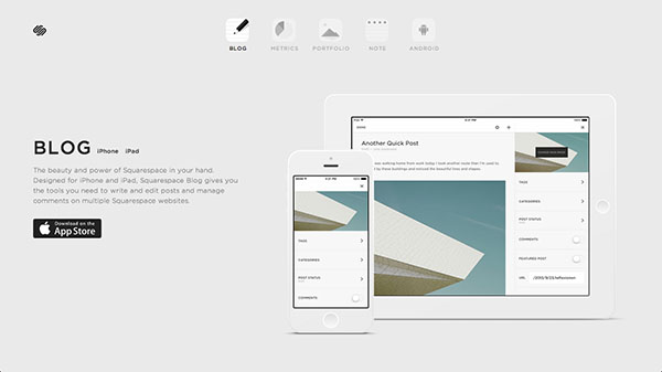
The whole purpose of the landing page is to specifically advertise and show off your product. However, you can do this more specifically. You can show off your product through a demonstrations or presentation. Say you are selling an iPhone, you will show big pictures of it, you will show pictures of people using it. You will point to the various things it can do like increase value with this button right here. A lot of these things will be intertwined you will mention features and a demo together. That’s okay, it doesn’t have to be separate. At the end of the day, you are trying to show your product in a good light and show what problems it can solve and what capabilities it has.


This is my favorite part of creating any landing page, you can be very creative in the way you present a product. I enjoy pages with short bursts of text that are to the point and amazing images either with illustrations or photography. These types of layouts are easy to digest for the visitor; don’t make them work to understand what makes your product awesome.
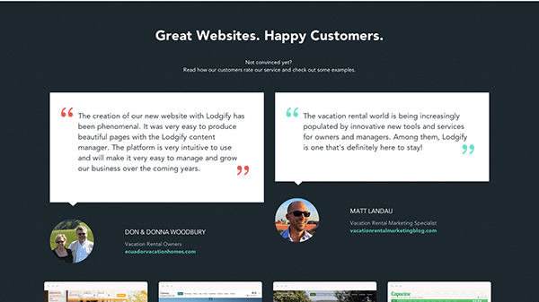
Some people need further convincing
People will doubt you, it’s just the way we are. We like the product, but we don’t know 100% if we want it. What if it doesn’t work all that well? What if it won’t be enough? You get the idea. The best way to push people over the fence is to show them some social proof, show them what others are saying about your product.

Social proof is when you prove the credibility of your product by the words of people who have used it. This can be done through testimonies, “Tim is an amazing designer, he helped guide me through the whole processâ€. This can also be done by providing quotes from publications like Wired, Smashing Magazine or what not. Even publications that are not famous like BeingLimited will help you because the fact that someone praised you is great! You can show off tweets of users who loved your product or pictures of happy users with it. Be creative with this! Credibility is very important and can only help your conversions.
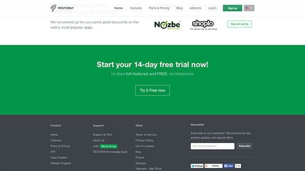
Final push to action
I’ve stated previously that people need to be guided as to what to do. This is especially true on long landing pages because your visitors will forget your original call to action even half way down the page. That’s why if you have an exceptionally long page it’s a good idea to sprinkle call to actions in-between various sections. Don’t be obnoxious about them, subtle is good as it doesn’t put pressure on the user and make them run for the hills.


However, every longer landing page should have a call to action section on the bottom. Yes a whole section dedicated to a call to action. Make the sign up or purchase easy as possible for your visitors. If you want them to sign up, give them a quick form to fill out their email and password right then and there. Boom, converted! If you want their email, just give them the news letter sign up right there and then too. If you want them to buy something… you get the idea. Like always, keep it simple and light. Just because someone made it all the way down your page doesn’t mean they will automatically convert. Life is just not that easy.
Your turn
For all the newbies out there, let’s see what you’ve got! I want to see the awesome landing pages you’ve created. They are not as scary as they sound! Or at least share some of your favorites that you don’t see listed in this post!
Comments will be moderated and
rel="nofollow"will be added to all links. You can wrap your coding with[code][/code]to make use of built-in syntax highlighter.