Website navigations have been getting more and more creative over the recent couple or so years. Our browsers are capable of handling crazy animations and interactions but at the same time our design style is calling for simpler and sleeker designs. Overall, I found that navigations are going towards a more simpler and minimal design, although not always. In general, web design as a whole has been favoring simple design so it should be no surprise that navigations have too. Without further ado, let’s go over some recent navigation trends.
Lack of navigation
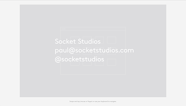
One very interesting trend in website navigation is the lack thereof; I think it is very interesting that some site leave out navigation all together. That could only work if two variables are met, you are confident in your target audience’s abilities and your user flow is great. I don’t think senior citizens who happen to use technology would be able to handle this. But, tech savvy designers could. It is, in a way, very elegant of website to cut out the navigation all together but at times, it makes sense where it is unnecessary.
Scroll based navigation
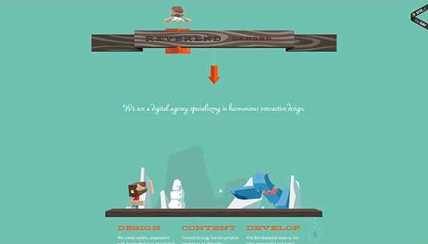
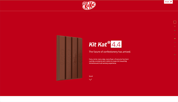
Minimal navigations are everywhere. One form of these would be navigation that is on the side that just indicated where you are as you scroll down. These navigations are just little and simple waypoints that let you know how far along the page you have gotten. I have noticed that sites with this type of navigational breadcrumb like style are very much about telling a wonderful story as you scroll and are much less preoccupied to make sure that you know that you are now on the ‘how it works’ section as it is all part of the pig picture, the overall story. This type of navigation can only be pulled off if the overall user experience and the overall page story are well executed.
Minimal navigation
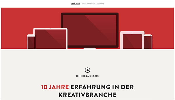
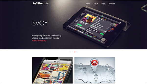
And of course we have websites where the navigation is in fact there, but it is not the focus of the page at all and navigation is therefore still kept minimal. For smaller website like portfolios or small company websites site it is not necessary to have a rigorous navigation like one would expect big ecommerce website like Best Buy to have. It would be terrible for Best Buy to have minimal navigation, image if they did not have any like the examples above or below; it would be a disaster. But, smaller websites where navigation only helps the users get around a little bit is not as necessary and it is then okay for the navigation not to stand out as much.
Side navigation
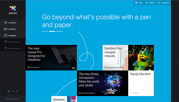
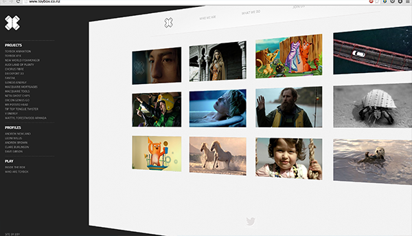
Even a couple of years back you wouldn’t be caught dead designing a side navigation to a website. It was not necessary taboo but it has a bad stigma of being an outdated way of going about navigation. However, recently side navigations have been making a comeback. They are practical when there is a list of thing for navigation or just another design rout when there are only a few navigation links. Either way, the current side navigations are much better looking then the previous and are nothing to be ashamed off. All of the examples below demonstrate wonderful use of side navigation.
Rounded navigation
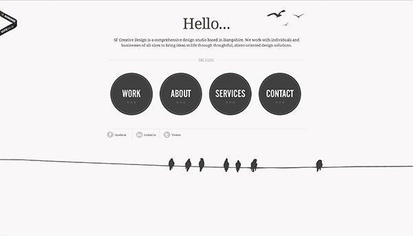
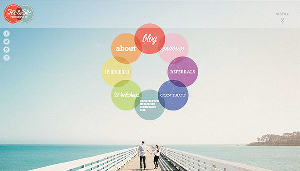
This last trend I found to be very subtle but interesting. I don’t think it is as obvious as the rest but it is gaining some headway. Web design in general has taken a turn into more subtle navigation, as you saw in the above examples. But circular elements in design have too been getting a fair share of attention. Circles in general call a lot of attention to themselves because we are not used to seeing them in web design, this is why in the below examples your eye is just drawn towards the navigation – it is different, it is interesting.
Conclusion
As you can deduct, there are so many different types of navigations. None of them are wrong or right – it all depends on the experience you are creating for your users, so if your experience calls for no navigation at all, all the power to you. Navigation is a very important aspect of a website even though some designs may take the light off it, it does depend on the design needs in order for you to figure out which navigation is best. I hope that going over the current navigation trends have helped you realized what styles of navigation are trending now. Are you going to create one of these for your next project or create a new trend?








Comments will be moderated and
rel="nofollow"will be added to all links. You can wrap your coding with[code][/code]to make use of built-in syntax highlighter.