Introduction
Color blocking could be called the bricks and mortar trend of web design. Using square (or rectangular or even curved) colored boxes as a design tool are beginning to show up almost everywhere.
The trend started in the world of fashion. Bags, shoes and even sweaters sported the trend of putting multiple colors together – but not as a pattern – as separate blocks of color.
Now that trend is moving into design.
And the colors you see may not be what you would expect. The trend is focused primarily around bright colors – no beige here – and hues that don’t always seemingly go together. (This very much mirrors the fashion trend.) So what you may find is a website that uses pops of color in pink, orange and red … all at the same time.
But it works – well. The popular design tool is simple and creates a lot of high contrast. The visual effect can be quite stunning as designers use color to guide users through a site. Everyone is doing it in slightly different ways as well -- solid color blocks, color blocks for text or photos and color blocks with a touch of animation for a hover-over surprise.
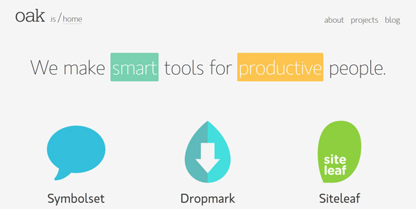
Solid Color Blocks


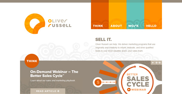

The most common use of color blocking in web design can be found in the simple use of brightly colored geometric shapes. Often used are squares of rectangles, bright colors and sharp edges help grab a user’s attention.
Some designers are starting to expand the reach of colored blocks to include other shapes such as circles or items with more rounded edges.
Often these blocks are of a single color – no patterns or gradients – but can contain other elements such as text, photos or illustrations.
The common factor among all of the different styles of color blocking is simplicity. The colors are simple and bright – the trend is to use a palette of primary colors, or neons, high-color muted hues. The shapes used for the blocking are also simple and lack decoration – from shadowing or 3D effects, to patterns or multiple edges.
And this simplicity is why color blocking works. The trend is both easy to build and develop and it is easy on a users eyes. Because of the use of bright, distinct color there is no question as to where a user will look first on the site. Palettes with such bright colors can be fun to create and use and sites using these schemes tend to have an open look, feel and mood.
Color Blocks and Text


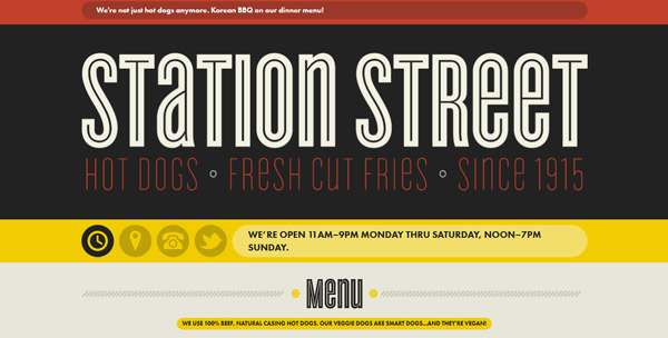
Using color blocking techniques to highlight text is a great way to highlight the most important words on your site.
It works using an almost highlighter-pen function or by placing text in bands of color. Both options can really bring focus to the words on the site.
When using the highlighter method, consider using black text and using a neon color to bring focus to the words. Play with options that both highlight small blocks of text or larger chunks of type. What you most want to be aware of is text size.
Using color blocking as a highlight tool works best when with large text. It can be harder to read at smaller sizes.
Using large color blocks or bands (that stretch from edge to edge) can be another effective tool for brining attention to text. This type of display features color and letters in a way that is visually stunning and can be a great alternative for a site that is lacking great images.
Contrast is an important consideration when working with color and text. It is important to use text and color blocks that are from different parts of the spectrum so that users can clearly see the color and read the text.
The stroke weight of text can be equally important when placing it on a saturated background. Opt for type styles that feature medium- to thick-stroke weights that are consistent throughout each letter.
Color Blocks and Images


Pairing color blocking and images can be challenging but also result in beautiful design concepts. The key to success is to keep everything simple – from color choices, to image and photo selection to proportion and size.
Work with images and colors that have complementary or contrasting colors to add impact to each. When working with color blocking and images, try to keep text placement and font choices simple. You want users to look at the images and colors first as they are drawn to the information on the screen.
Color Blocks and Surprise
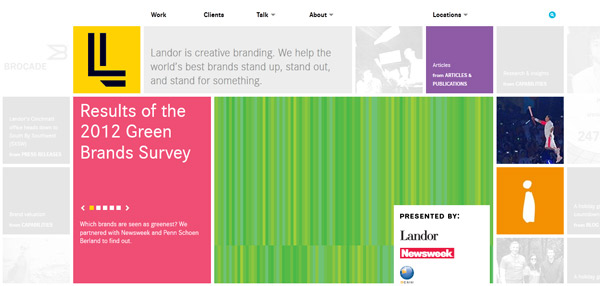

One of the more fun color blocking effects out there is to use them to create a hint of surprise. Two of the best examples are showcased above, but you must visit the sites to really get a feel for how it works. The concept is simple, click on a color block and something else happens.
At Landor, you click on gray blocks that change into a pop of color with text information in each. What really makes this color blocking technique work is that you get a pop of color and facts one at a time. The gray boxes all turn into different colors, emphasizing the bright and fun trend.
The surprise is a little different and more subtle on Kyle Steed’s site – when you hover over the color blocks at the bottom, the colors become more vibrant. This adds emphasis to where the user is focused on the screen and the text within each block.
Conclusion
What really drives the color blocking trend is high-color, high-energy design.
When executed properly, the effect is a simple but creates a strong visual interest. Blocks of color contrast with non-color (or black) areas to center the attention of users.
Though trendy now, this design technique is likely around to stay because of its simplicity and almost universal appeal.
Comments will be moderated and
rel="nofollow"will be added to all links. You can wrap your coding with[code][/code]to make use of built-in syntax highlighter.